Learn to Draw Series
Light and Shadow
Learn how to add realism and dimension to your sketches with these shading techniques shared by TopHatch designer Lasse Pekkala.

Course Materials
Download Course Materials (includes JPG and concepts files)
Learn how to import and use your files below.
Tools
To follow along with this tutorial, you'll need a pencil or pen and a piece of paper, or a digital drawing app like Concepts.
Set Up
If you have a comfortable space you like to spread out and think or sketch in, go ahead and set up there. If you're out and about, bring some paper and a couple of sketching pens in your bag, or your digital tablet and stylus, and find a spot where you can move your arm, shoulders and body comfortably.
If you’re using an iPad, you can watch the video and sketch at the same time using iOS’s split screen ability:
1. Open the video link.
2. Swipe upward from the bottom of the screen to bring up the command bar.
3. Tap+hold+drag your drawing app's icon and drag it upward to your preferred drawing side (right or left).
4. Expand it to split screen by tap+hold+dragging the inner side edge of the interface toward the center of the screen.
Sketching Tips
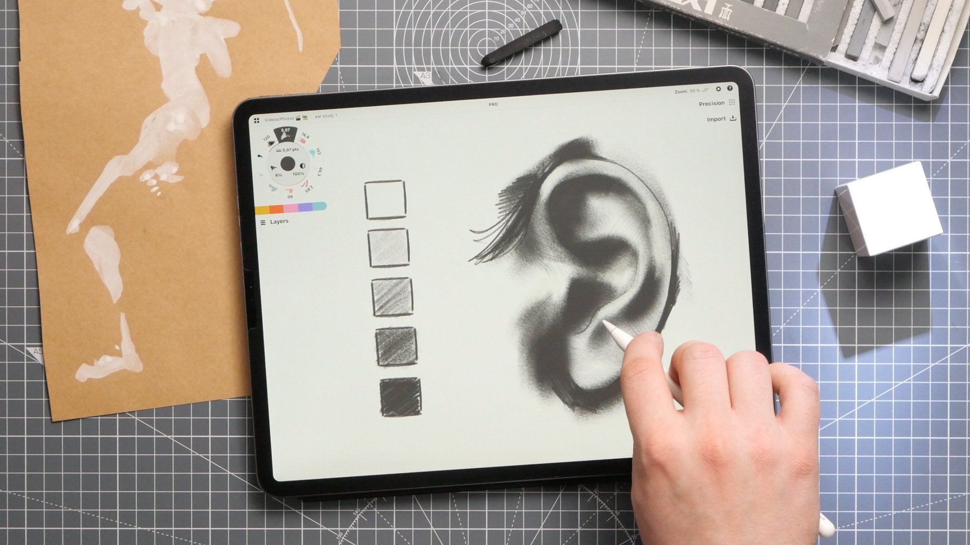
Shading is creating the illusion of depth in a drawing by adding contrasting values to your sketch via differing saturations or shades of grey. Values represent light and lack of light in an area. They ground your drawing by sharing what the context looks like on and around your object. Shading adds solidity to volumes and shows the eye where objects sit in their surroundings.
Value Range (1:33)
There are at least as many ways to create values as there are drawing tools. Watercolor, pencil, charcoal and markers all have their different densities and techniques to create gradients of value. You can also accomplish a lot with just a ballpoint pen.
The amount of value or contrast you need in an image depends on your end goal, but a range of five different values is a good place to start. The lightest - value 1 - can be is as light as your paper. The darkest - value 5 - will be as dark as you can press with your tool. Fill in the rest of the values between 1 and 5, making sure you have enough difference between each value to make the contrast clear.
Shading Planar Forms (2:43)
The first step in shading is to define the main direction of lighting for your object. It might be helpful to sketch a faint sun or directional arrows pointing toward your object.
Step two - look at your object as a set of planes, with each plane facing different directions. Which plane would catch the most light? Grade the planes in order from 1 - 5.
Choose a set of values in increasing depth from light to dark. Usually these are grey, refering to shadows, but for graphic art purposes, they can also be made of increasing brightness in a color. Number them from 1 - 5.
Fill in your planes with the corresponding values.
This method is used in creating dollar bills by pressing ink at different values into paper, and was historically used by Rembrandt in his etchings in the 17th century.
Shading Round Forms (4:59)
When a light shines over the surface of a sphere, it will hit a boundary line called a terminator. The light will not pass this line, as the remainder of the curve recedes and is hidden by the front face. It becomes the transition zone between light and shadow. This initial shadowed area is sometimes referred to as core shadow, and is where shading appears darkest on round surfaces.
When applying shading to less regular surfaces, draw the contour lines of your shape first to help you understand the volume of the form. Then choose the position of your light source, and note where your highlights will be. The shadow line will mimic or flow around where your highlighted areas are, and your shading will extend around this shape away from the lightsource.
Shading doesn’t have to be exact with organic forms. Surfaces can be very forgiving in terms of getting shading to look right. What matters is keeping your main light source and core shadow line in mind.
Shading doesn’t have to be exact with other forms, either. Sometimes just adding a hint of shading to a shape can add a quick sense of dimension or interest to your drawing, and lift your sketch off the paper. This can be a stylistic decision, or just help you to move through your sketches fast.
You might want to finish your shading by adding an additional highlight or reflection of the light source shining on the surface. This will be your lightest value.
Analyse Reference (8:19)
The best way to gain experience with shading is to analyse and practice from reference. When looking at an image, try to train your eyes to only see it in terms of value - or light and dark areas. These appear in simplified, abstract shapes that you can replicate on your page. See how well you can draw your object using only these shadowed and highlighted areas.
A great exercise is to try coloring objects with a very limited set of values, or even just two. In these exercises, use the paper as the light value and your pigment as the shadow. Or try using a darker paper as the shadow, and add highlights with a lighter pigment. Try different mediums and colored papers. These are forgiving techniques and allow you to move fast through your drawings.
When drawing more complex shapes and shadows, it helps to break the whole composition down into simplified forms first, as described in the second video of this series. Then start adding in the reference linework, shading and highlights.
Cast Shadows (9:41)
The shading within an item is defined by the direction of its key light source, but objects also block light from the areas around them, creating what are called cast shadows.
Cast shadows are great for grounding your object and tying it into its surroundings. Cast shadows can help to define lighting, contour, and spacing - aka the distance between your object and surrounding surfaces.
Practice creating a cast shadow with a simple box. First, define the angle of your shadow by drawing reference lines from the center of the light source to the furthest corners at the top of the box, and extend the lines beyond it to the ground.
Next, define the direction of your shadow by drawing reference lines from the ground that is directly below your light source, across to the bottom corners of your box and beyond it. This establishes both the ground of your box and its shadow.
Finally, where the angle lines and directional lines cross, connect the intersecting corners with a new set of lines. This defines the boundaries of your box's cast shadow.
Try shining a flashlight above your reference object and see what happens when you move it around. The lower your light source, the longer the shadow becomes behind the object. The closer your light source, the more distorted the shadow becomes.
Doing these exercises will help you to become familiar with referencing your areas and shadows. In the long run, you don’t have to draw reference lines for everything you see. It’s enough to know generally how they are cast to get across the idea. At the same time, the more convincingly you sketch, the more realistic your piece will be. Reference exercises help you to become faster at drawing while executing with more precision.
With digital tools, you can make cast shadows very effectively by simply duplicating, then distorting the mirror of the object. If you like, go ahead and blend the shadows into the background some, to mimic the diffusion of light in reality.
Homework (13:29)
Below in the Course Materials section is a practice sheet I've prepared for you to help you work on your shading. This sheet contains several forms for applying shadows and highlights, and for practicing cast shadows. It also includes reference images for you to work on analysing the shapes made by light and shadow. Try out the exercises I’ve shown in the video and see how much more confidence you gain with your sketching.
Course Materials
Download Course Files (includes JPG and concepts files)
Importing the File
Tap the download link and choose your file type from among the options.
Downloading a JPG file:
1. Download the file and choose whether to save it to your photo roll or files.
2. Drag+drop the file onto the canvas from your photo library or files, or use the Import menu to open the file.
Downloading a .concept or .concepts file:
1. Make sure Concepts is already installed on your device - choose your app version here. Download the .concept (Concepts for iOS) or .concepts (Concepts for Windows, Android, Chrome OS) file on this device.
2. Tap open the file. This will bring up an option to Share or Open In your app of choice. Tap Concepts.
3. The file will automatically open for you as a new drawing in the app.
4. Sketch right on top of the file or use layers to organize your work (below).
Do you have questions about the tutorial? Please email us at concepts@tophatch.com and we'll be happy to help. Comments and feedback are appreciated!
Learn to Draw Playlist on YouTube
Learn to Draw Video + Course Materials by Lasse Pekkala
New to Concepts? Try these YouTube tutorials:
Learn Concepts for Android & Chrome OS
Recommended
One Point Perspective Sketching - Architect Bhupesh Malviya shares how to draw an urban sketch using One Point Perspective.
Architectural Design Series - Learn architectural design sketching on Concepts with award-winning Architect Osama Elfar.
Setting Up Your Menus, Brushes and Presets - Learn how to customize your canvas layout, menus, tool wheel and brush presets in Concepts.