Concepts is an infinite, flexible creative tool for all your good ideas. Available on iOS, Windows and Android.
(Good) Texture Makes It Taste Good
Try these exercises to add mouthwatering texture to your drawings.
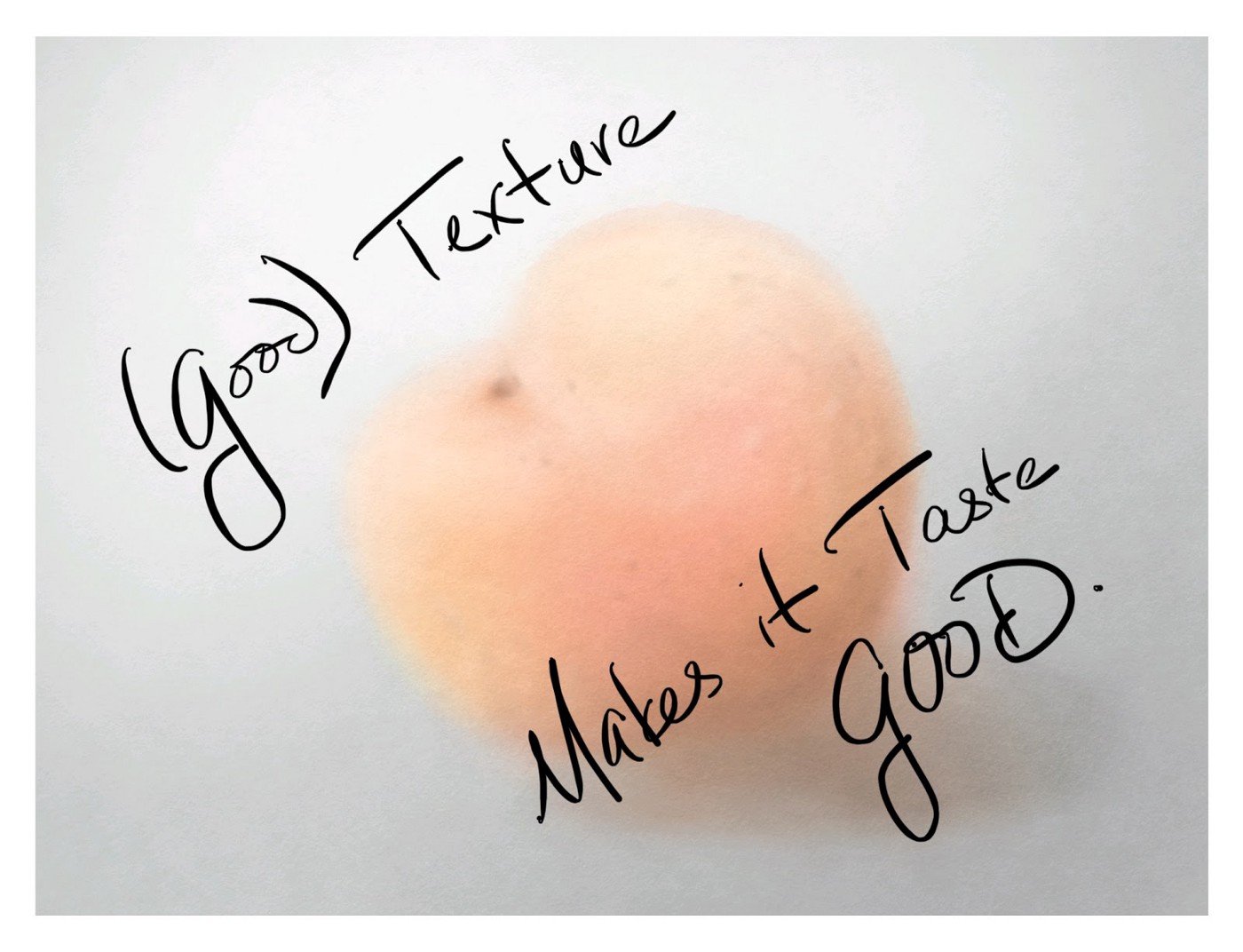
Texture is a compelling idea, and not just because of the word’s inherent x factor. It can catch your tongue or make it curl, draw you in or repel you to the moon (or bathroom).
The reason why it’s so compelling might be because of the way it suggests contrast. We instinctively sample the world around us and compare elements to capture our environment’s flavor. Compare the sourness of a not-quite ripe berry with the sweetness of a fully ripe one. Consider the hot sand underfoot with the coolness of waves, or a tightly woven carpet with a loose shag rug. These contrasts define our realities and reflect the world.
Touch an item without texture and you can’t feel it — in fact, our minds classify the experience as a hallucination. But encounter an edge and immediately there’s a new dimension to explore. Perhaps this is why artists seek to add texture to their drawings in so many ways — through layout, focus, voice, varying mediums… layering the effects to create an alternate reality that makes you want to dive in and stay.
Let’s explore some techniques to add texture to your sketches using the Concepts toolset.
Set Up
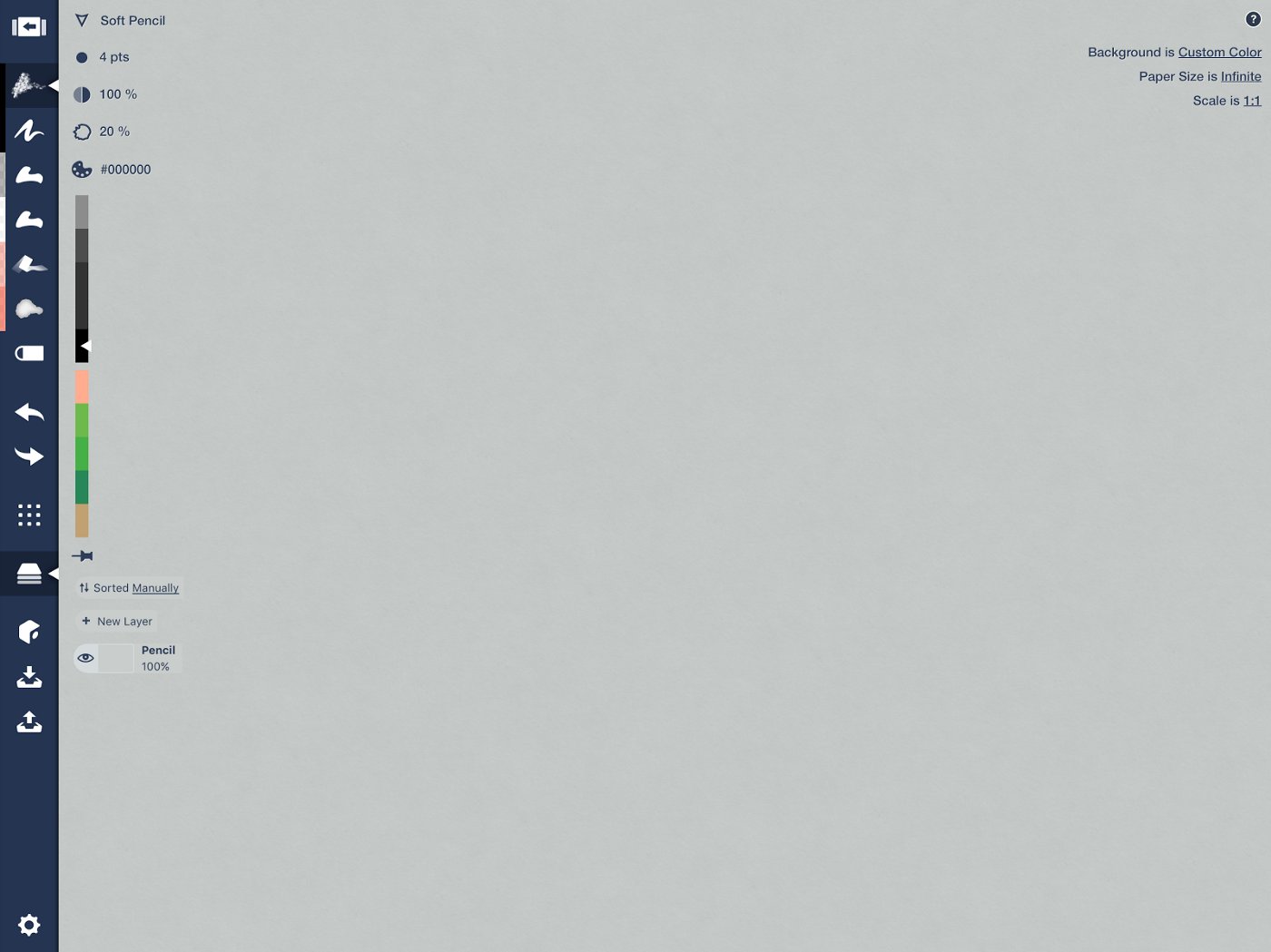
Line your toolbar with a Pencil (both hard and soft pencil are lovely choices, just pick one), the Fountain Pen, the Filled Stroke tool in black and one in white, a Marker, and the Watercolor brush. These are the tools we’ll practice with.
We’ll also use Layers, so open up that menu.
And be prepared to use the Duplicate function on the Selection popup, visible when your drawing is selected.
Choose a medium-tone paper type as your background. This can be heavyweight paper or a custom color like gray. You could also take a photograph of a nice medium paper and use it as a background. I chose N2 (N for Neutral tone, saturation number 2) from the color wheel — you can see dark and light colors easily on this paper.
Pencil
When the Concepts development team created the hard and soft pencils, they analyzed actual pencil markings to make them as real as you can get in the digital world. They’re satisfying to draw with — they allow you to achieve textures like you see in this shark hunting scene by Santtu Kouvonen.

Illegal Shark Hunting by Santtu Kouvonen.
Exercise
Take our your pencil and draw a simple object like a peach. Do only the outline and do it with a single line.
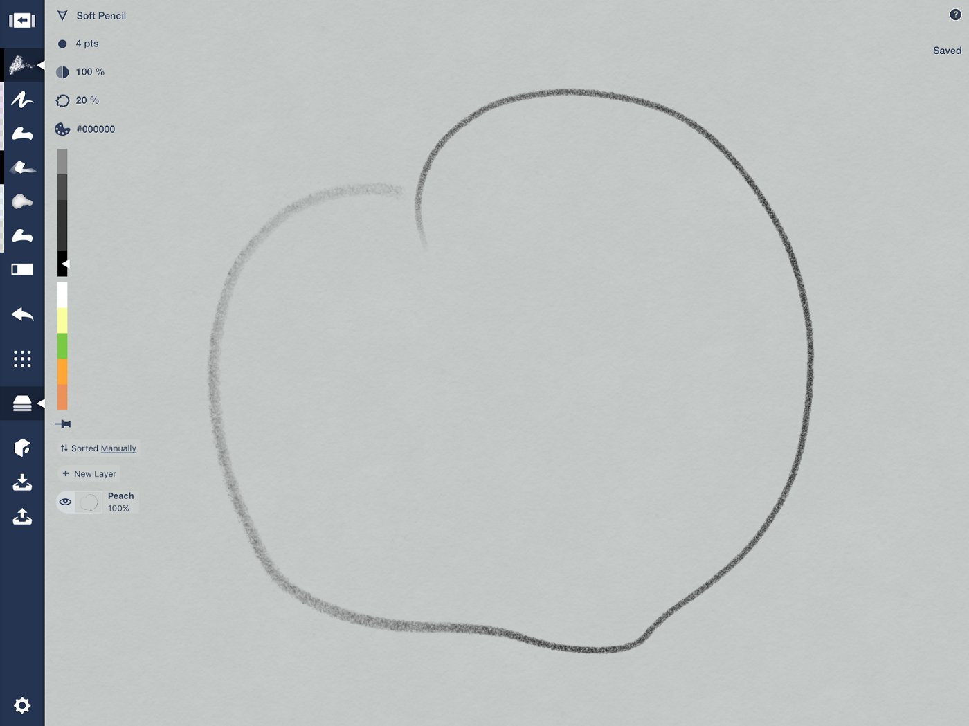
One line makes a peach.
Call the layer “Peach.” Now make a new layer and drag it beneath your pencil layer. Call it “Pencil.”
Nestle a wide stroke or two of pencil near the bottom edge of the peach. If you have an Apple Pencil, you can do it with tilt. If you have a different stylus, make your pencil tip fat and draw it in.
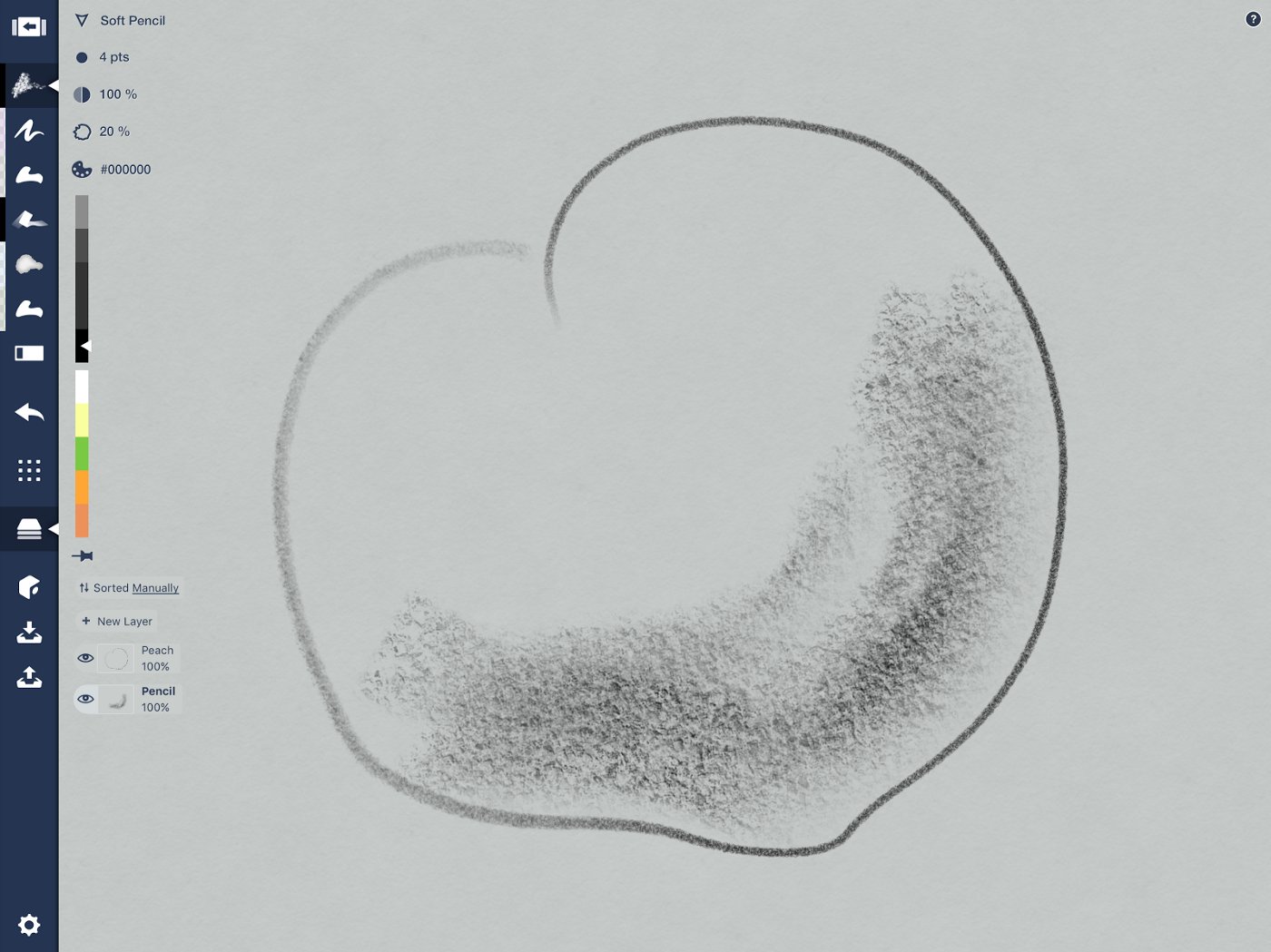
The contrast of a dark line adds dimension and shadow.
With a few strokes, you’ve given your peach dimension by suggesting the texture of its skin, its curving shape, and where it lives in the world.
If you like, you can up the texture by adding more contrast. Select your thick line and duplicate it. Switch the copy to a lighter color and position it so the strokes barely offset each other. Do you see the sharp texture appear? Like sun shining on a canvas.
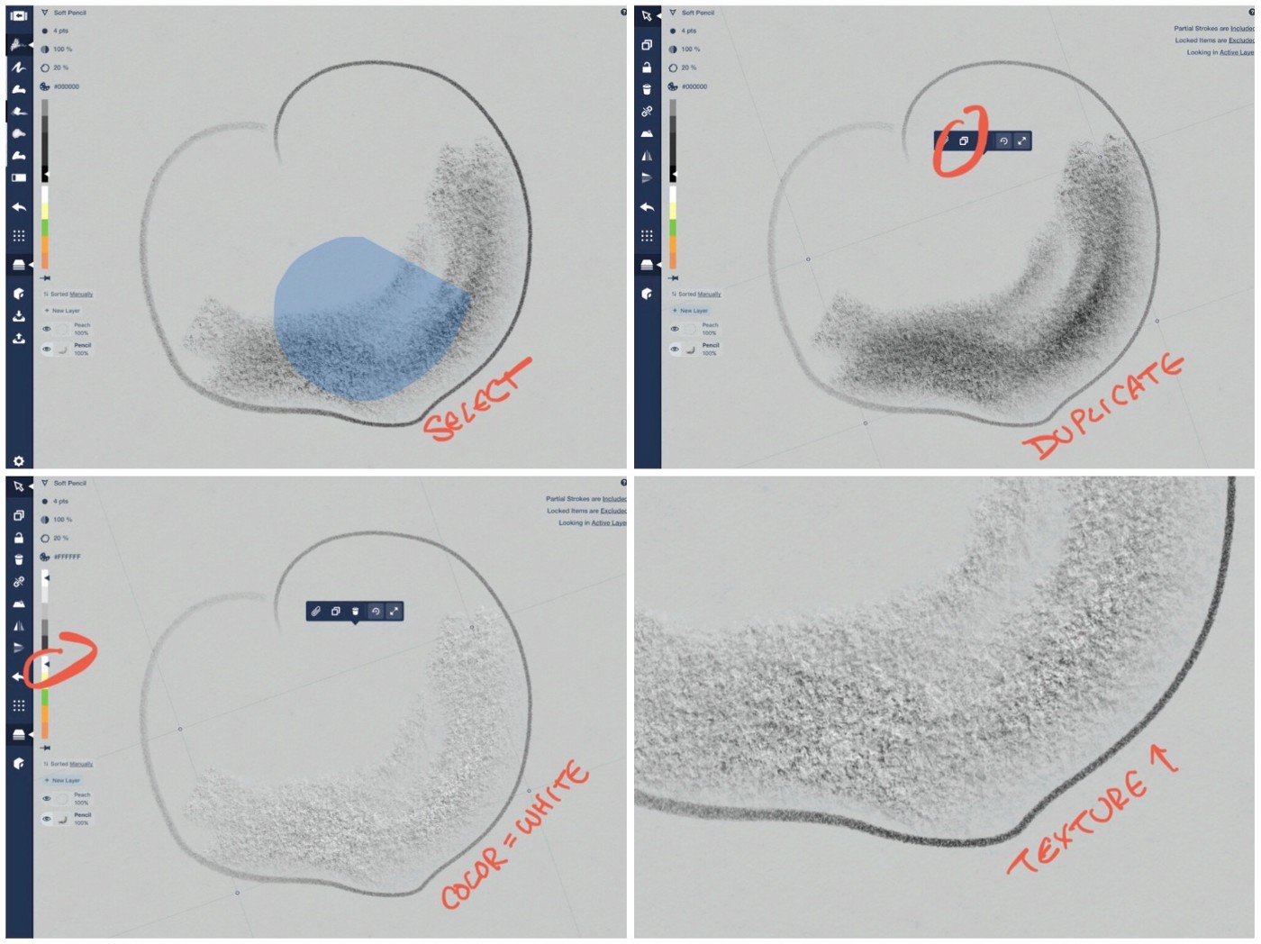
The texture is almost like cement.
For a more subtle look, layer a very low opacity (7%) black or white pencil over your base color, like here in the background.
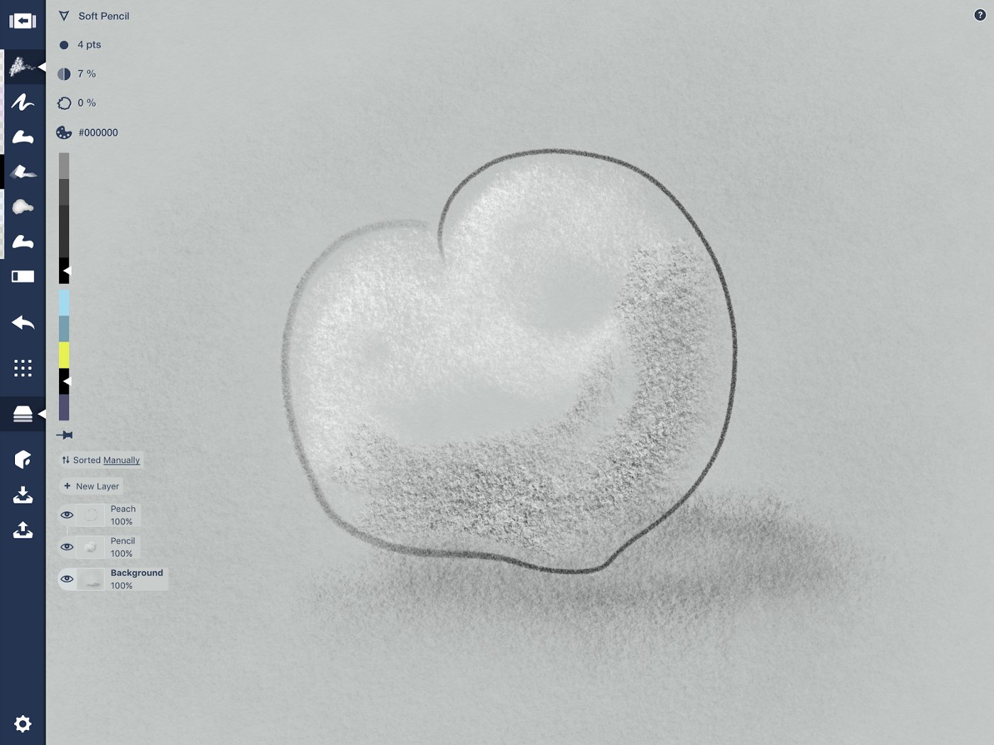
You can hardly see the background, but it adds ambience.
From here, you can flesh out your peach with some juicy colors, or leave it grayscale and move on to the next exercise.
Fountain Pen
The pen is a favorite tool for inking more permanent ideas, as well as for the textures you can create with strokes called hatching. Some of my favorite ink scenes are the ones created by urban sketchers, who capture details in architecture or street scenes with their favorite pen.

An urban sketch from a trip to Barcelona earlier this year.
Exercise
Select your peach outline from the “Peach” layer and duplicate it. Move it to another area of your canvas and change the tool to the Fountain Pen. You can leave it thick, or thin it to a fine nib.
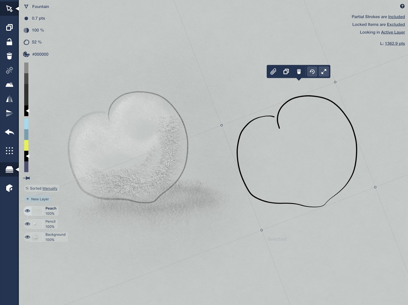
A .7 pts Fountain Pen at 100% opacity.
Make a new layer beneath the Peach layer and call it “Pen.”
With a loose hand from the bottom edge of the peach, pull the pen upward in quick strokes right beside each other. The finer the hatching, the finer the overall detail — hatch as finely as the width of your ink allows.
If it helps, you can sketch in your light source and expected shadow in another layer to help you know where to place your ink… then you can hide or delete the layer later.
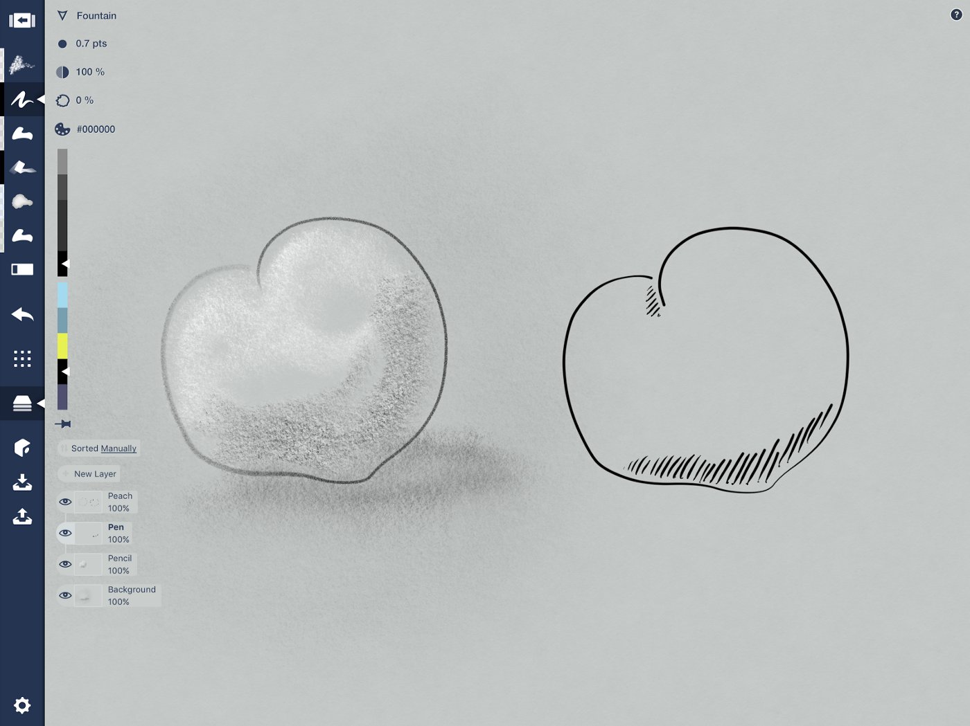
Quickly hatch in parallel lines to represent shadows.
The ink represents the darker areas of the peach where shadows fall. The more ink, the darker the area. To make the shadows more prominent, try hatching the opposite direction along the very lowest edge of the peach, right on top of your first lines.
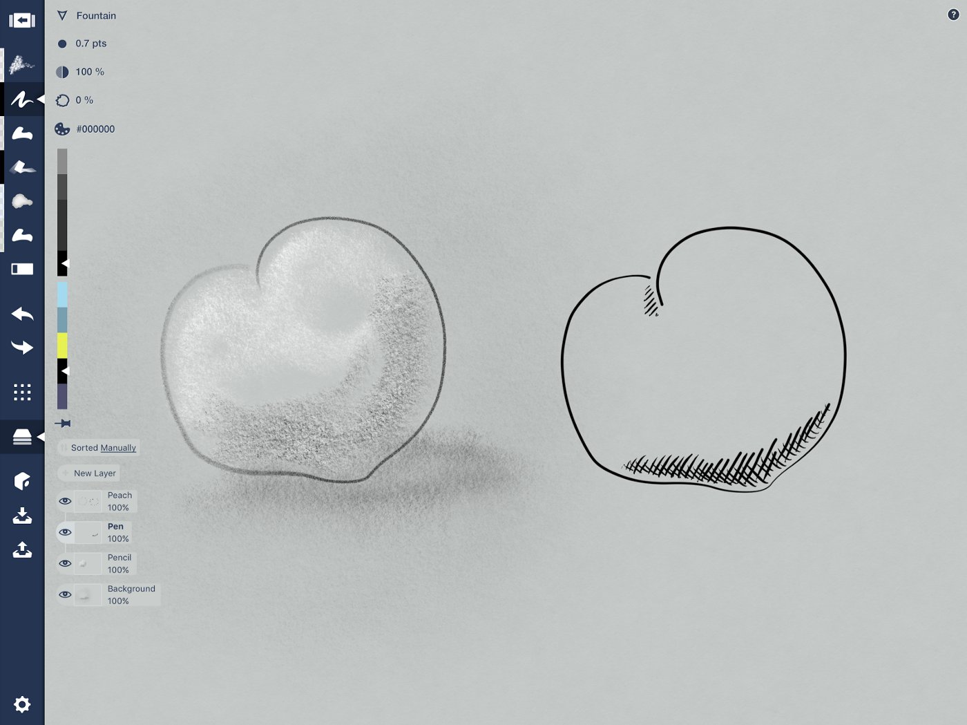
Cross-hatch at the bottom where the shadows are thicker.
If your peach is quite fuzzy, you can add in little marks representing the texture of the skin.
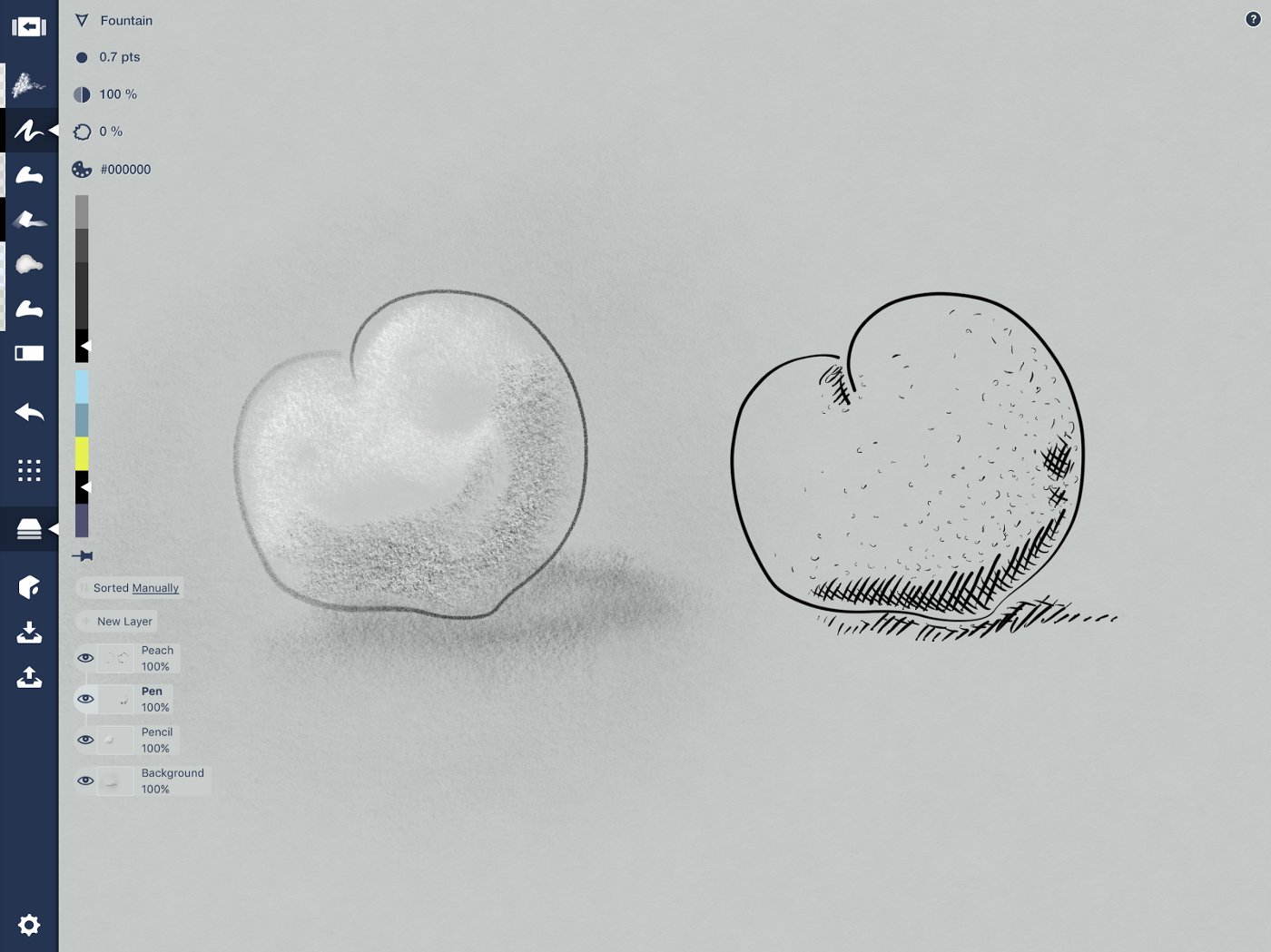
Fuzz me.
Filled Stroke
The Filled Stroke tool fills all the positive space you’ve drawn within your stroke. If you overlap a bit, it will create a negative space and remain empty. This is really fun to play with… you can get very detailed lines and textures using this tool, like in this example of woods.
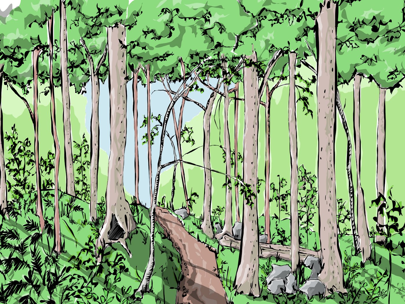
“The Woods Road” inspired by a road of the same name in Virginia. This is all Filled Stroke.
You can also use it with transparency and layer strokes on top of each other to create highlights and shadows, giving your drawing depth.
Exercise
Duplicate your peach again and change it to the Filled Stroke tool. You’ll notice it changes to a filled shape. Set the opacity to around 40%.
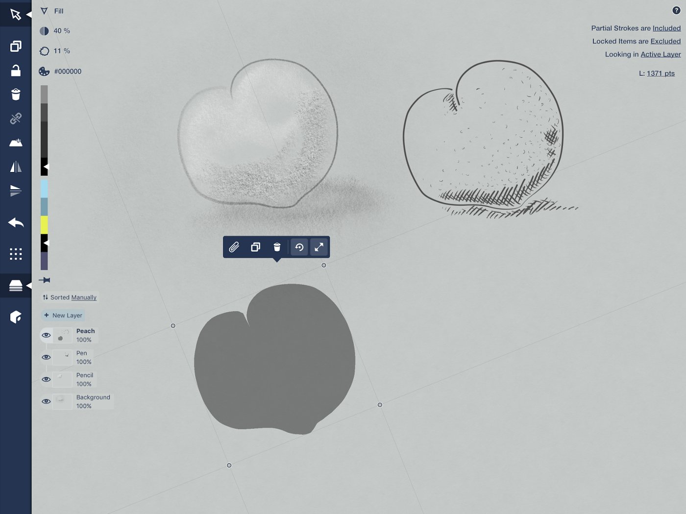
Choose your black Filled Stroke tool from the toolbar and trace the lower edges of your object, then trace along the bottom portion of your peach and curve above it to give the peach some natural shape.
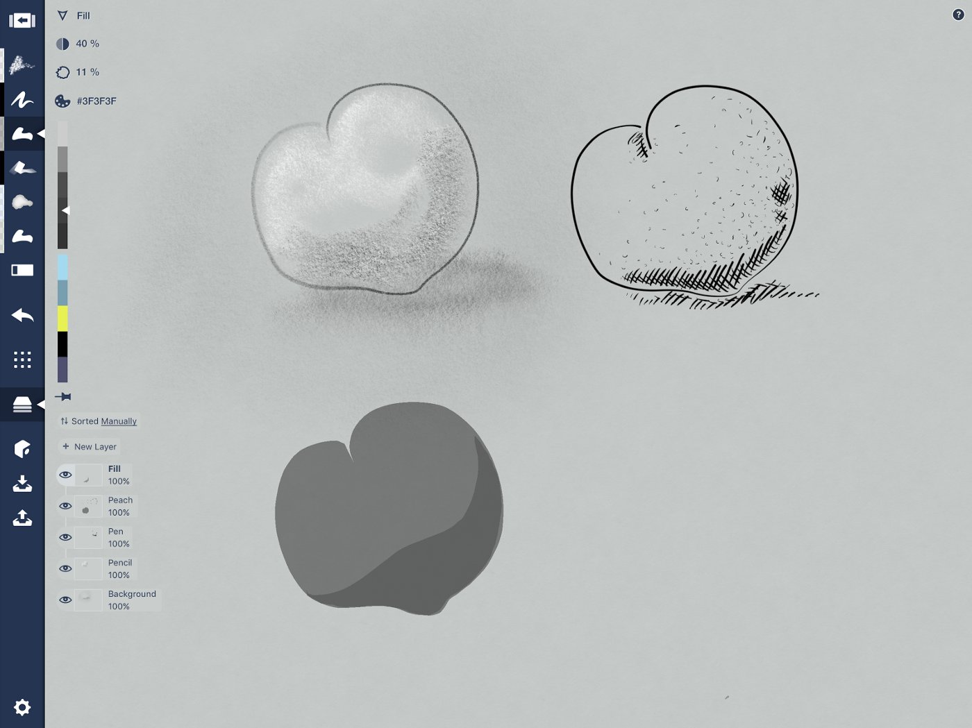
When layering on shadows, place the layer above the base color.
Layer a second shape over the first at the bottom edge, leaving the sunlit edge open. See how it creates the effect of depth? Add as many tiers as you like — the lower the opacity, the more you can add. Try making it topographical. You can build up highlights from the top using the same method with a nearly transparent white (between 7 and 15%).
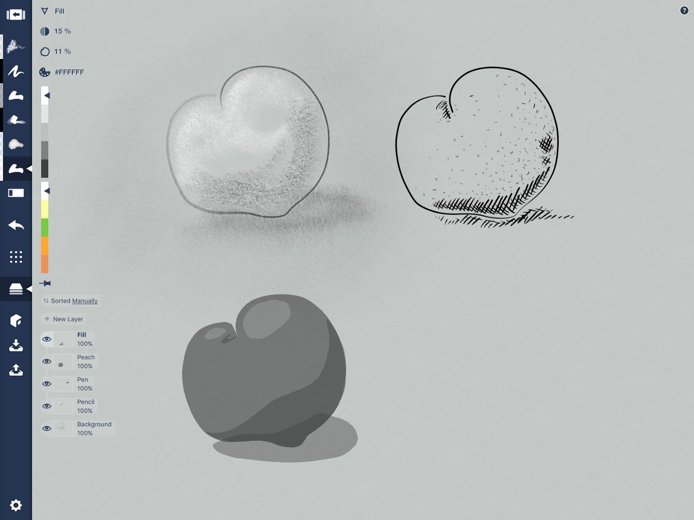
Three tasty peaches in three tasty styles, but let’s try some color next.
Any time you want to add a custom solid shadow — whether to give dimension to a character’s hair or features, or to give your sketch a physical context — the Filled Stroke tool is a good way to go.
Marker
Markers have a wonderful texture. The COPIC markers Concepts shares the color wheel with are alcohol-based, allowing them to sink into the paper and layer beautifully. The digital version share their semi-opacity and edge, and have a lovely inner texture we can take advantage of. You can also layer them on thick and achieve this gorgeous result by Alex Sheers.
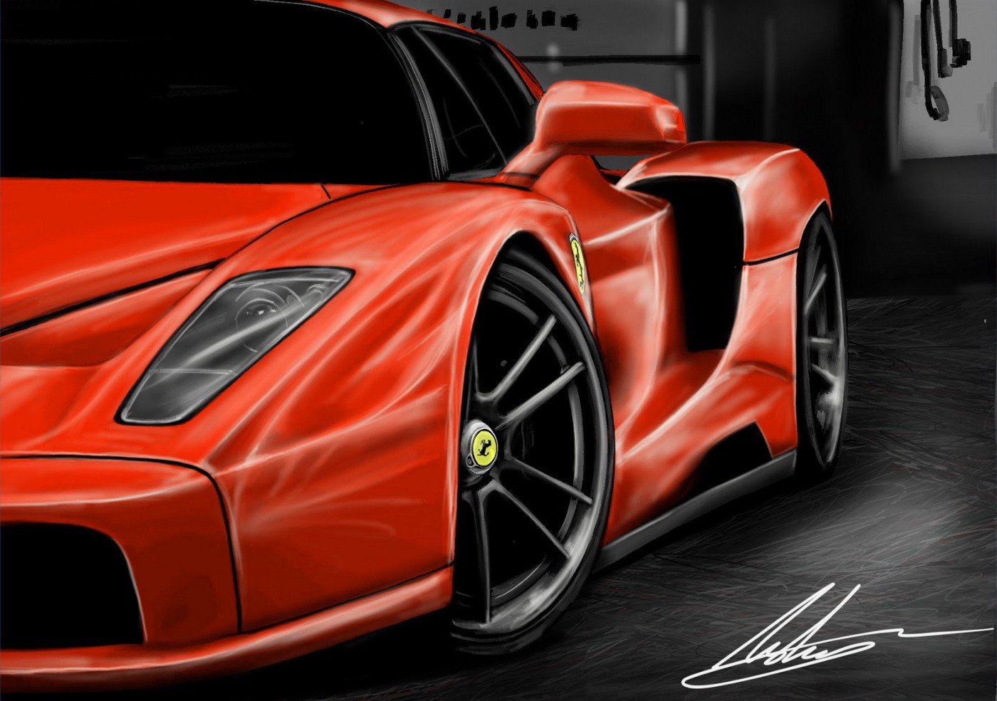
Ferrari by Alex Sheers — you can read how he made this with marker here.
Exercise
Instead of switching to a marker outline, let’s select a pen or pencil version of the peach and use the markers to color it in, traditional-style. Except non-traditional style, we’re going to get messy and color outside the lines, then clean it up after. This lets you pull your texture all the way to the edge.
Choose a pen or pencil version of your object and duplicate it. Switch to a marker tool in a peachy color you like. Make a new layer, pull it beneath the outline layer, and label it “Marker.”
Now color in your object like mad. Scribble over (under) the lines. Or try striping them in. Or use one giant stroke on a smaller object for some subtler contrast to your background.
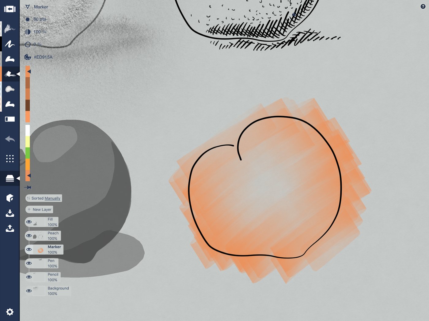
Go over the edges.
Keep going and layer the colors on. The COPIC color wheel stacks different color saturations together, giving you a gradient of complementary colors to choose from. Go medium colors for tone, layer on lighter colors for highlights and darker saturations for depth.
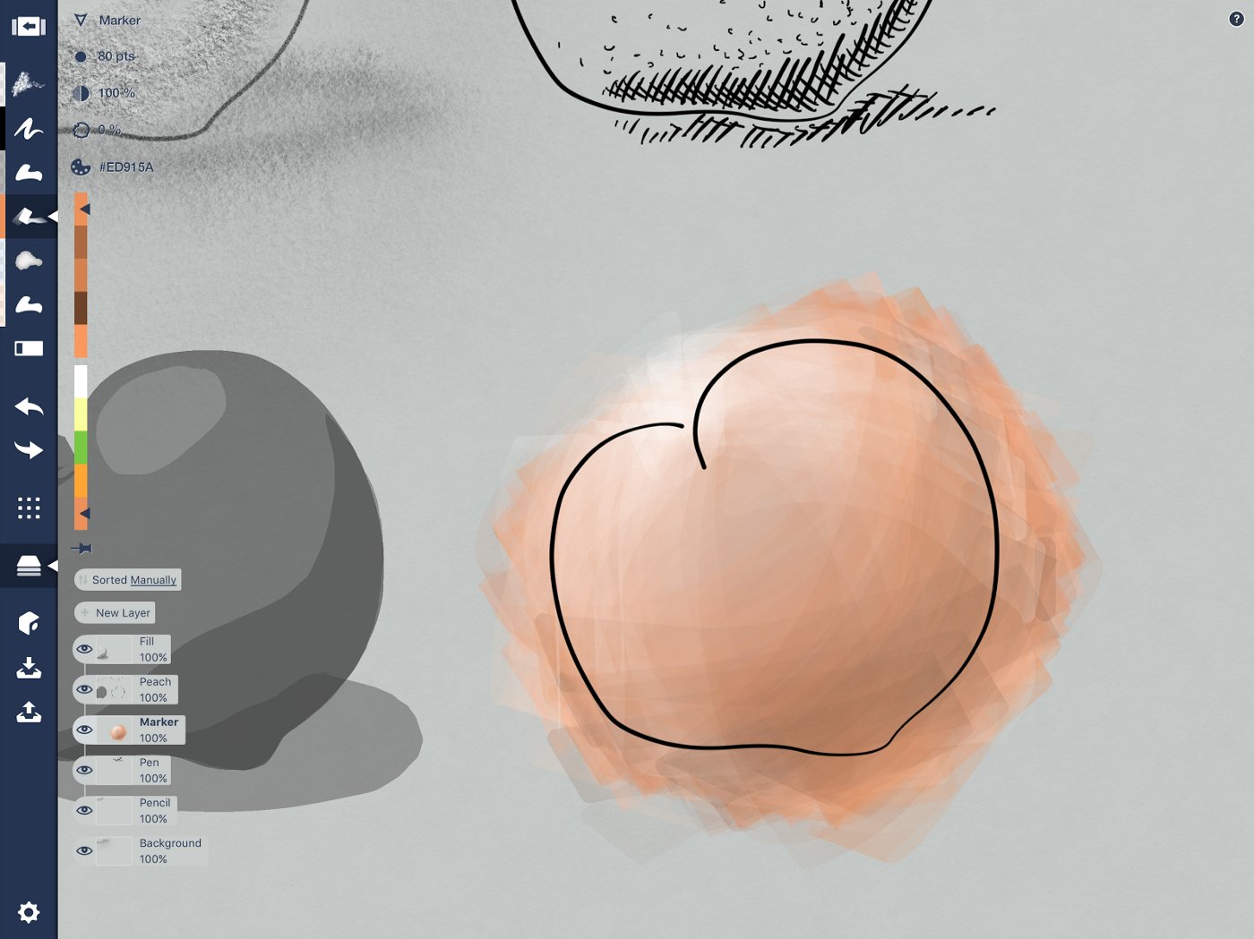
Cross directions and use the stroke’s angle to give shape to your peach.
Then take a hard eraser and mask those outside edges. If you like, go back to your background layer and marker up a messy shadow, then use the soft eraser to ease a reflective shadow into place.
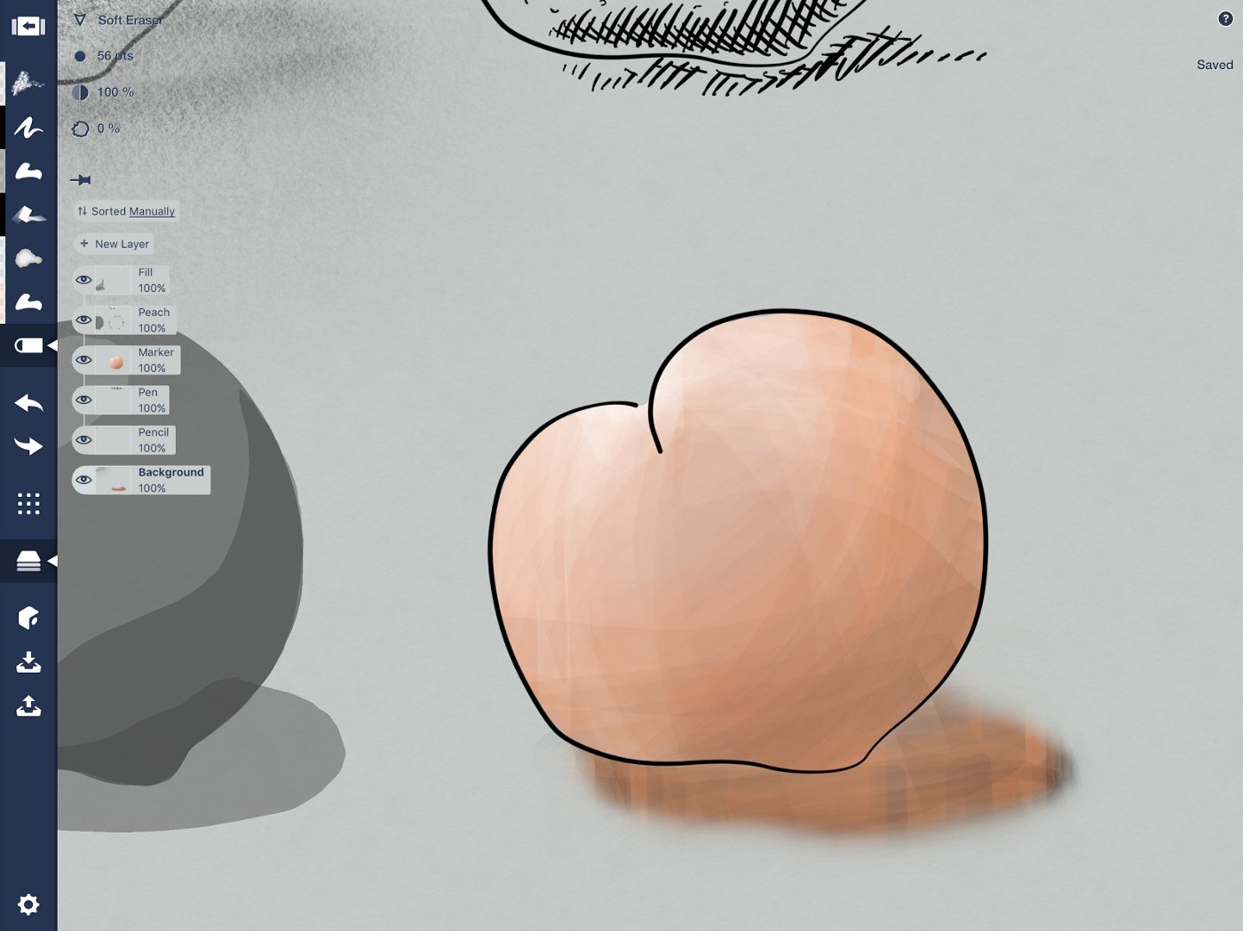
Every shadow has a bit of the surface and the object’s reflection mixed in.
Watercolor
Watercolor is one of my favorite mediums of all time. The layering and blending abilities of this medium combined with its organic edge make me fall in love again and again, whether it’s the real or digital version. The urban sketch shared above was painted with the Concepts watercolor brush, as was this flower.

Tulip on heavyweight paper.
Exercise
Like the marker exercise, duplicate a pencil outline of your peach and create a layer beneath it labeled “Watercolor.”
Choose a watercolor brush in a base color and paint it on. You can paint carefully and keep the organic edges, or overlap your lines and mask later. Since peaches change color gradually, I’m going big, then adding a few details after.
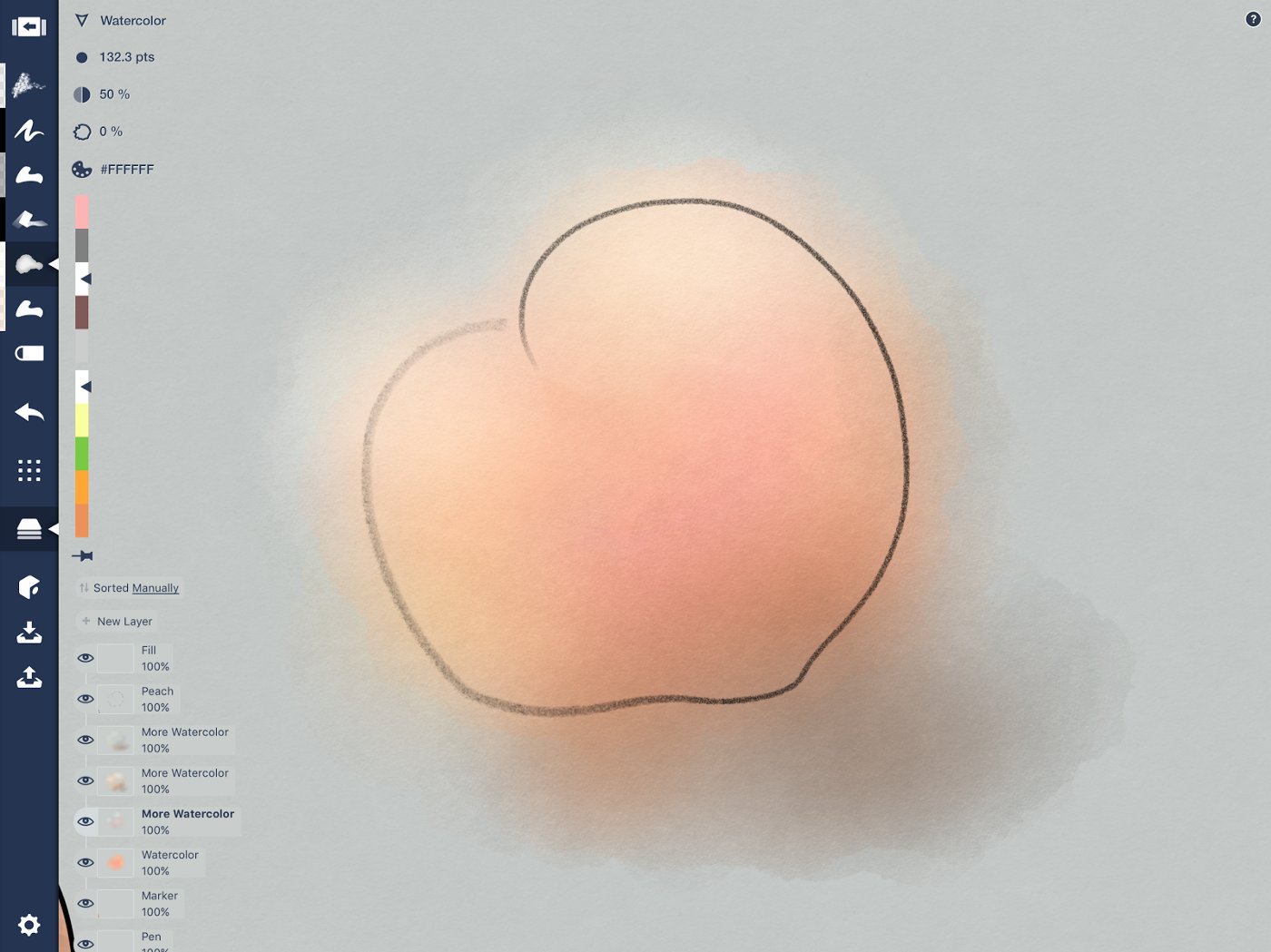
Adding shadow as I draw so I can keep some of the reflective colors mixed in.
Blend colors in the same layer, or start layering on the colors. Use as many layers as it takes to give your peach its ultimate peachy deliciousness. Again, take into account darker and lighter tones as you follow the principle of shadows and light.
At the end, you can hide the outline or leave it, depending on your style.
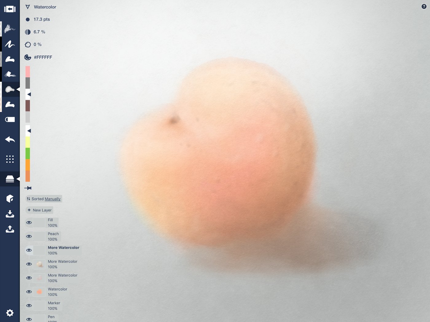
Traditional-style still life picked right off the tree, tidied up with some soft eraser.
I hope these techniques help bring your sketches an extra flavor of richness and life. When you've finished, you can share your art with us by tagging #conceptsapp on social or emailing it to us at support@concepts.app. Happy drawing!
By Erica Christensen
Recommended
5 Exercises for Drawing with Atmospheric Perspective - Add distance and depth to your landscapes and backgrounds with these exercises.
When Design Meets Cake, It Transforms Into Delicious - Chef Madison Lee adds flavor, sugar, and a dash of design on the iPad Pro to create artisanal, one-of-a-kind cakes for celebrations.
Drawing Shapes Instead of Lines: 8 Exercises for Filled Stroke - Learn how to use Concepts' filled-stroke tool to create fluid, dynamic shapes in your drawings.