Concepts is an infinite, flexible creative tool for all your good ideas. Available on iOS, Windows and Android.
Creating an Acrylic-Based Brush
This tutorial shows you how to combine six acrylic stamps — made from a #4 Filbert Loew-Cornell paintbrush and Mars Black Liquitex acrylic paint — and turn them into your own digital brush to paint with in Concepts.
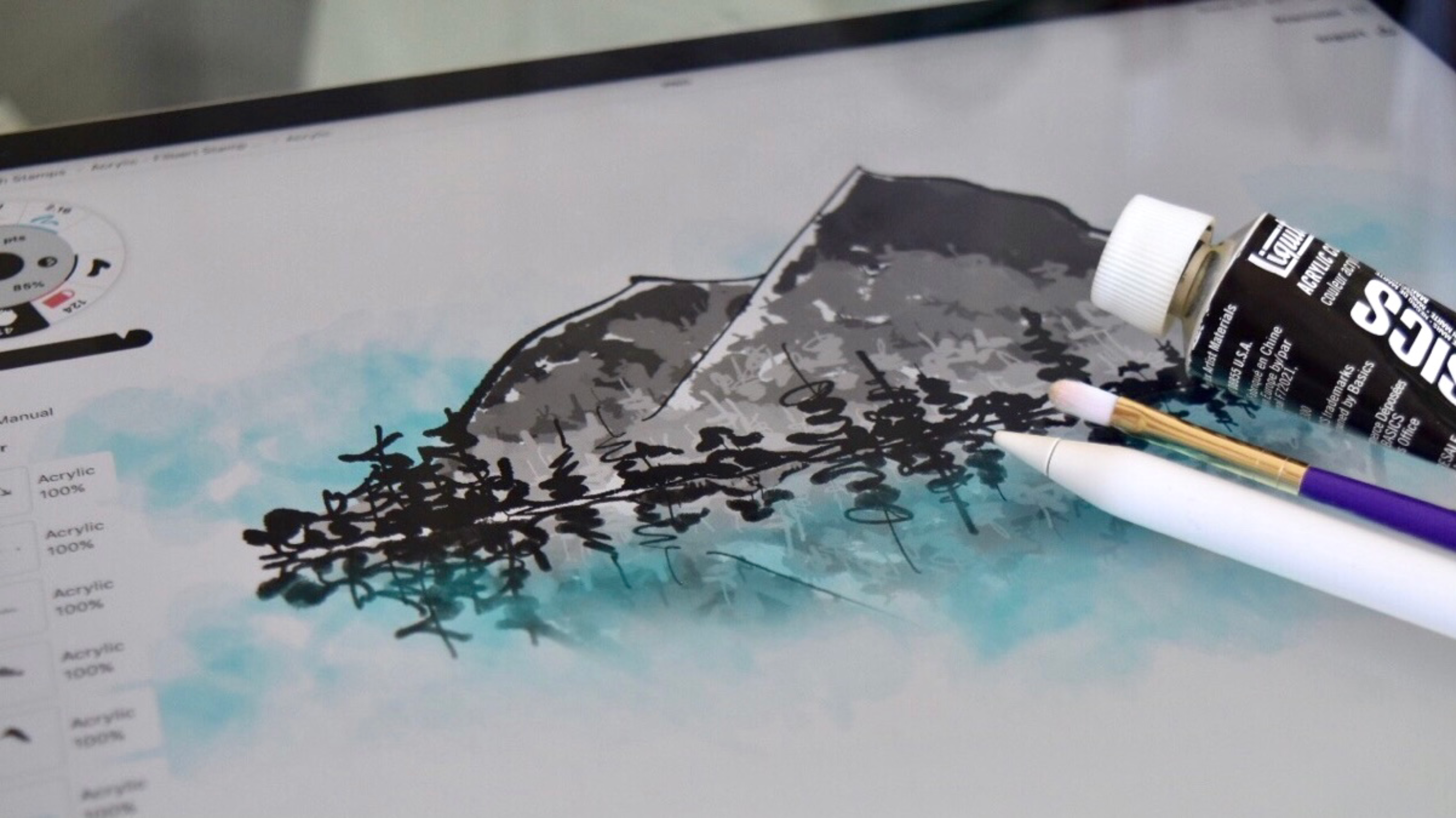
When you can take inspiration from a physical medium and turn it into a digital counterpart that looks, acts and feels like the real thing, you’ve suddenly stepped into a new universe of possibilities.
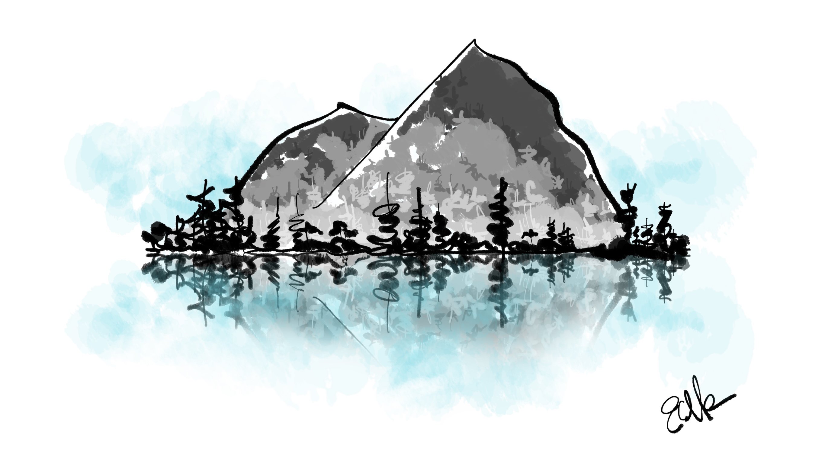
The painting below was created with one brush from start to finish (beginning with an actual brush with acrylic paint on its bristles), using a camera, the photo-editing app Enlight, Concepts’ brush editor, and a bit of painting zen on the iPad. Here is how it happened and how you can do it, too. As you follow along, please feel free to use the stamp images I’ve shared here to create your own acrylic brush (or many brushes), and paint your own inspirations as I create mine.
Creating the Stamp
1. The first thing I did was imagine what type of brush I wanted to draw with in Concepts. Texture is everything for me as an artist and layering up paints is very satisfying. Acrylics = a great way to go.
I found my brush collection, a tube of basic Mars Black Liquitex paint and some white printer paper. I squeezed the pigment onto a palette, smushed my brush into it and started to make stamp samples.
One brush evolved into many brushes. They looked like this:
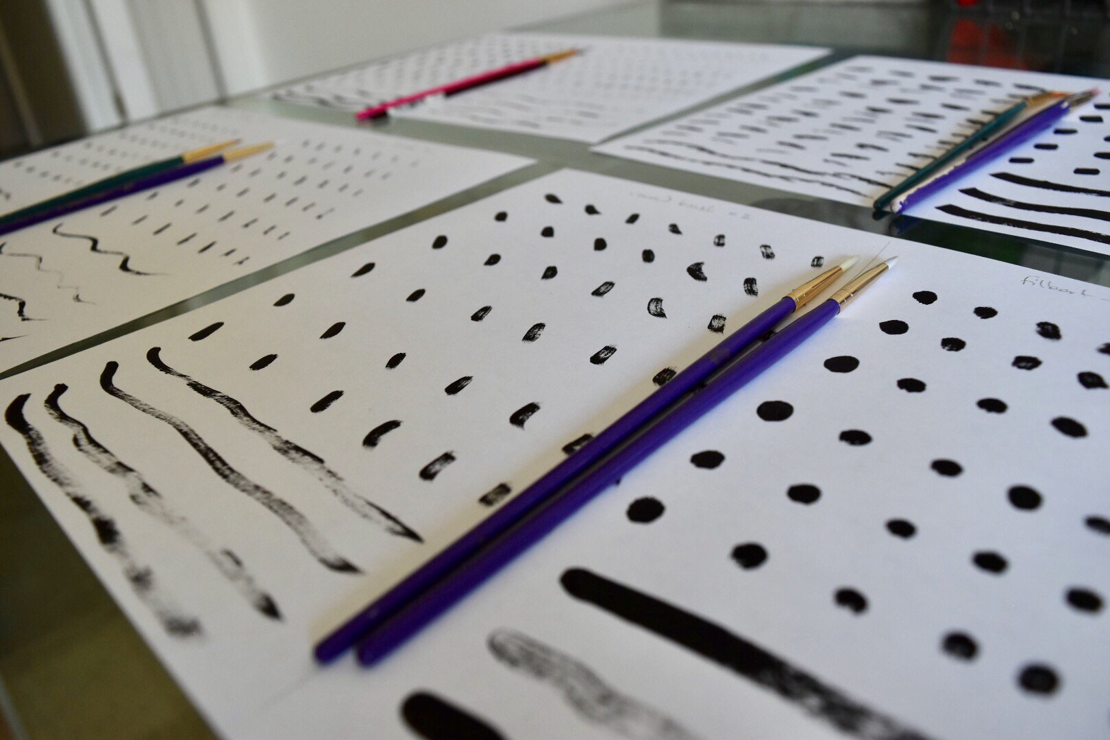
May as well do several brushes at once and play.
I painted six rows for six comparable sample types by column, working my way across the paper from a saturated brush to where the paint’s nearly used up and you can see the brush texture coming through. You can add up to nine stamps in the app but six gives great variation and randomness while keeping the overall brush size down.
2. Studying them afterward, I decided to take some of the circular stamps made with the filbert brush. It has a flat yet rounded brush tip for nice circles. They make consistent stamps that stack well together, yet offer a bit of varied texture at the edges.

These are fairly even, with good texture and a bit of variation.
3. I took close-up photos with my Nikon D5500 camera, and downloaded them straight to my iPad Pro. They looked like this:
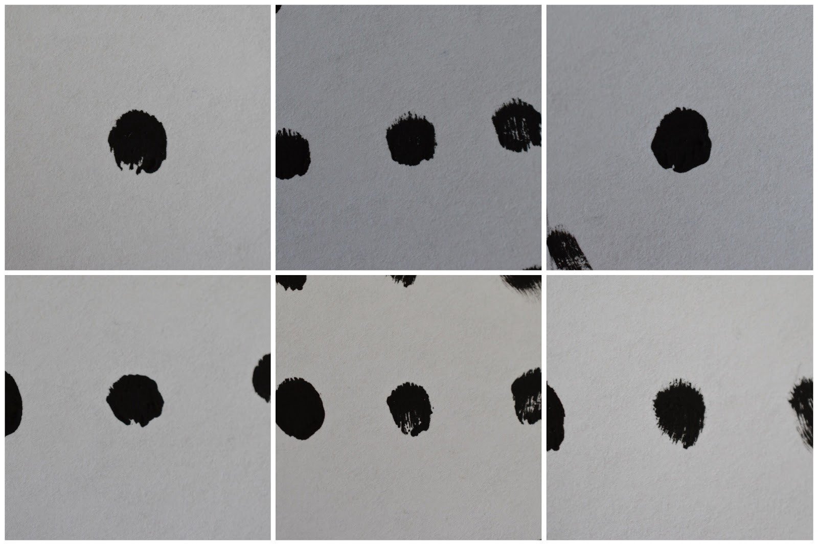
The lighting won’t matter in the end, you just need good contrast. You can also see tiny color differences in the paper grain made from the varying thicknesses of the paper — we want to get rid of these.
4. I opened up Enlight, a photo-editing app that allows you to isolate the paint sample from the grain of the paper using simple filtering.
It’s very easy. You choose an image, tap Filter -> BW -> High Key (or High Contrast if it looks too washed out), then expose the image to the filter twice. The first time you still see the grain of the paper, the second time takes the grain out completely so the paints are against a pure white background.
I saved them to the photo roll.

A pure white background is the goal, with a good edge to the paint sample. In the end, I decided High Contrast worked best for the first round of filtering, High Key worked best for the second round.
5. Time to crop the image. I opened Concepts and created a 256 x 256 px artboard. This is a smaller size, which is fine because I won’t be using the brush for giant background-like paint strokes, more as a liner with pressure variability like a real brush. In the painting, you can see how large the stamps can appear, even with this stamp size.
The only disadvantage is that if you zoom in very far (as they’re made from pixel-based images), they will pixellate. If you want to print giant-sized images from your stamp-based brushes, use a larger starting artboard size (up to 1024 x 1024 px) and make sure your image resolution matches up.
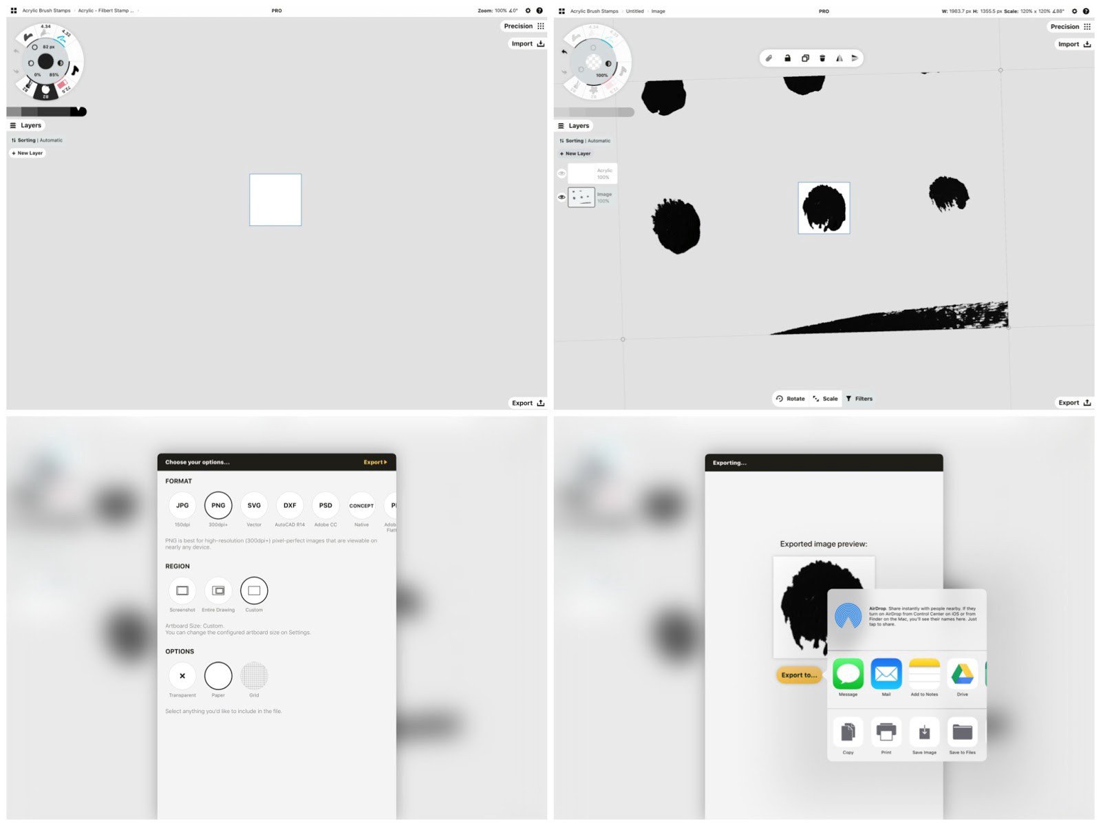
1. Settings -> Artboard Size -> 256 x 256 px. Plain white background. 2. Open Import menu, find the photo, center the paint sample into the artboard. 3. Export to PNG, Custom size. 4. Save image to the photo roll.
I imported the image, centered the stamp in the artboard, and exported it as a PNG -> Custom size to my photo roll. This was my first stamp for my new brush.
Then I repeated the process for each of the images. Depending on your device, the images may look big and fuzzy here… remember they’re very tiny when you use them in the brush itself. The added bonus is how you can select and move them about, as the brushes are also vectors.
Go ahead and download this stamp image. Import the image right into Concepts, frame a stamp in a square artboard, and export it. Then move the artboard to the next stamp and repeat. This is the fastest way to isolate them into individual stamps. (Again, it doesn't matter if they're blurry, they'll be clear tiny stamps in the editor.) You can make your own brush as you follow the steps in the next section.
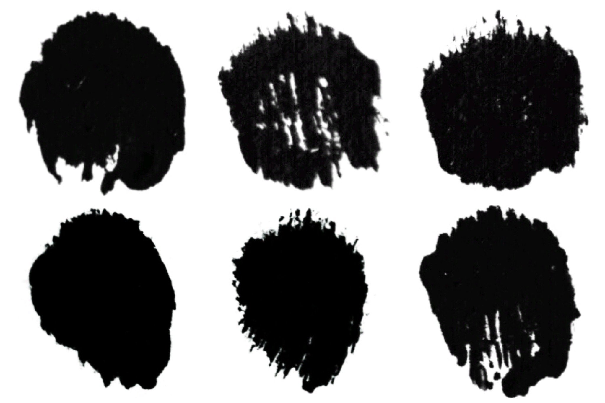
Acrylic stamps made from the real thing.
Creating the Brush
1. Now that I had stamps, I tapped a tool on the wheel and opened up the Brushes menu. I created a new pack called Acrylic Brushes, tapped + New brush, and tapped the new brush to enter the brush editor.
2. I chose Stamp as the core brush type (they’ll be stacking on top of each other, not revealing anything underneath), and added in all six of the stamps.
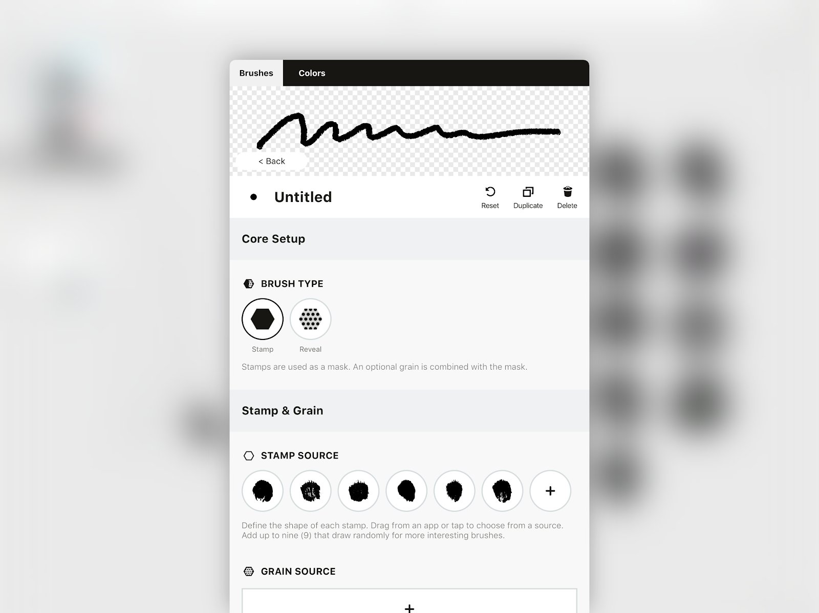
These stamps will randomly place themselves as you draw the stroke, making for great textural variation along the stroke’s edges.
3. Then I scrolled down to Size.
I made the brush size bigger so I could see the effects while I worked and drew a stroke in the viewer. It already had a really nice edge — six stamps rotating randomly with each other gives it a very nice appearance — but I wanted to play with it more, and, of course, apply properties to the brush action.
For starters, I definitely wanted it to react to pressure — when you press on a real brush, it becomes bigger. So I made a nice, smooth line upwards across the white range box in the Pressure variance graph. (For more on ranges and the brush editor, read here).
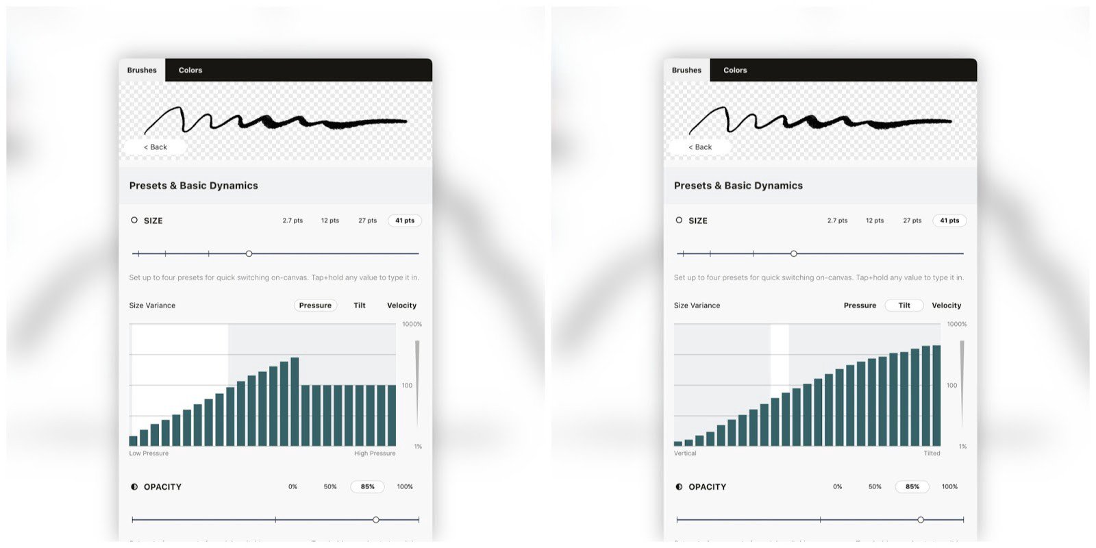
At the same time, I really like tilt for shading larger areas, just like tilting a real brush… I popped over to the Tilt variance graph (tap the Tilt button above the graph) and did the same thing with the graph there. Not much range in that particular stroke, but I drew it across.
I also kept the opacity quite high so you couldn’t see the stamps stacking on each other, but I pulled it down to about 80% opacity to get a touch of the transparency you get with thinner layers of paint.
4. Then on to Shape Controls.
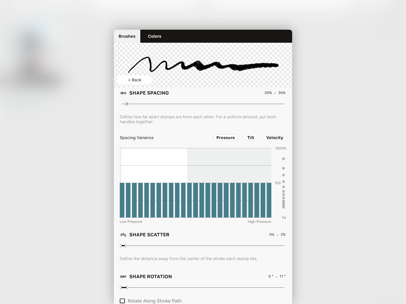
I wanted it to be pretty uniform, like drawing with a loaded brush, so for spacing, I kept the handles down at the near end and separated them minimally, to give just a bit of randomness… 30 - 35%. No variance needed.
Similarly for scatter, I kept this to between 0 - 2%.
Rotation needed just a bit more randomness for those edges but I really wanted it consistent, too, so it stayed at 0 - 11%.
This wasn’t anything particularly mathematical, it was just me having an idea in mind and playing with the settings until it acted right. When it looked like a textured, slightly random-yet-even stroke up in the viewer, I decided it was perfect. It reminded me pretty much exactly of a great brush, dished with paint and ready to go.
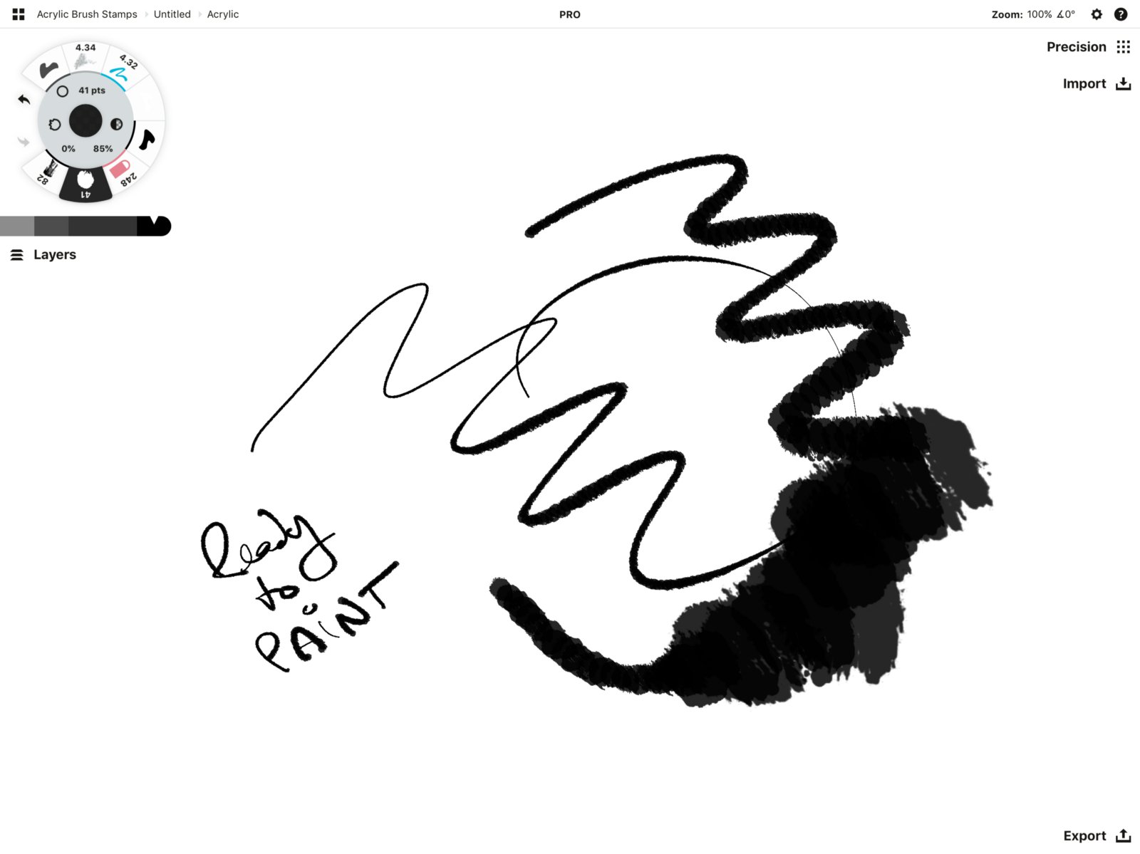
The stroke on the left (center) is only pressure. The stroke on the right is drawn with tilt and pressure. It’s responsive, fluid, and just how I want it.
Do you have your brush? Let’s move on to painting.
Creating the Art
1. When I feel like drawing but am not sure what to do for the day, I’ll often look on Google Images or my Pinterest boards for inspiration. I paint a lot of characters, creatures and trees, but I decided I was in the mood for something inspiring with good energy - like the mountains I live by, and maybe some trees and a reflection. No matter how many times you draw these, you’ll always get something different, just like nature.
I scanned through Google Images and drag & dropped the ones with elements I liked straight from my Safari browser into Concepts.

2. Reference images in place, I drew the horizon line. Then I roughed in quick, basic shapes for the mountains, and started scribbling in trees. The whole time I just focused on enjoying the feel of the brush.

3. In a layer beneath, I colored in the mountains, painting gray tones in different layers and tilting the stylus to pull out those larger shading strokes. I began dark for the steeper slopes up top, then worked my way down with lighter colors, as seen in the bottom reference image.
Then I added in some tree details with the same tones. I wasn’t too particular, I just wanted to enjoy the flow.
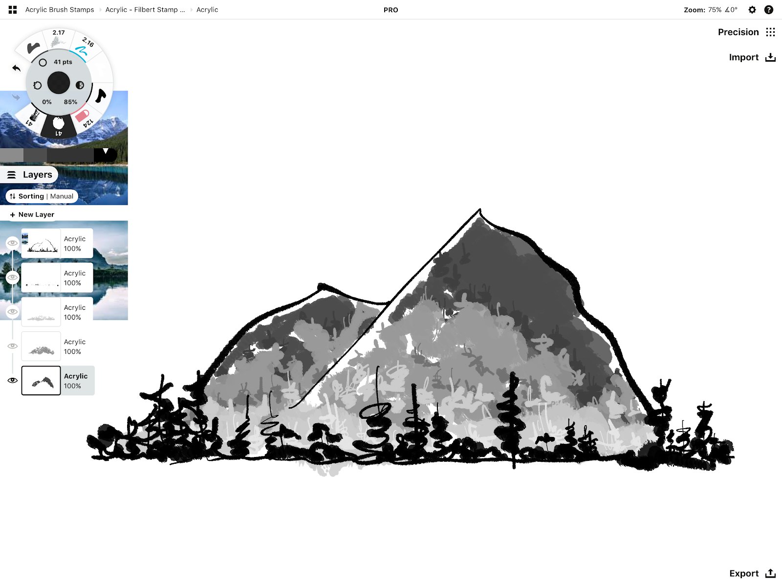
4. When the mountains were fleshed out, I needed to create their reflection. I selected the entire drawing in All Layers, duplicated and flipped it.
I positioned it directly below the original but before setting it to the canvas, I dragged it to a new layer to keep the two areas separate, then pulled the layer down to the bottom of the stack.
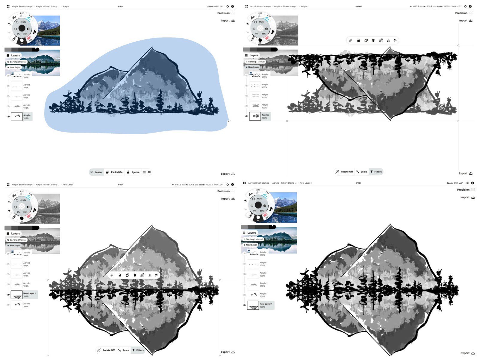
5. For the sky and water, I lowered the opacity of the brush using the controls in the tool wheel and chose a refreshing teal. Then I painted the color in a new layer behind the mountains, pressing and tilting my “brush.”
For the reflection, I duplicated the sky and flipped it down to create the water. I added it to another new layer, and this time dragged the layer in front of the mountains.
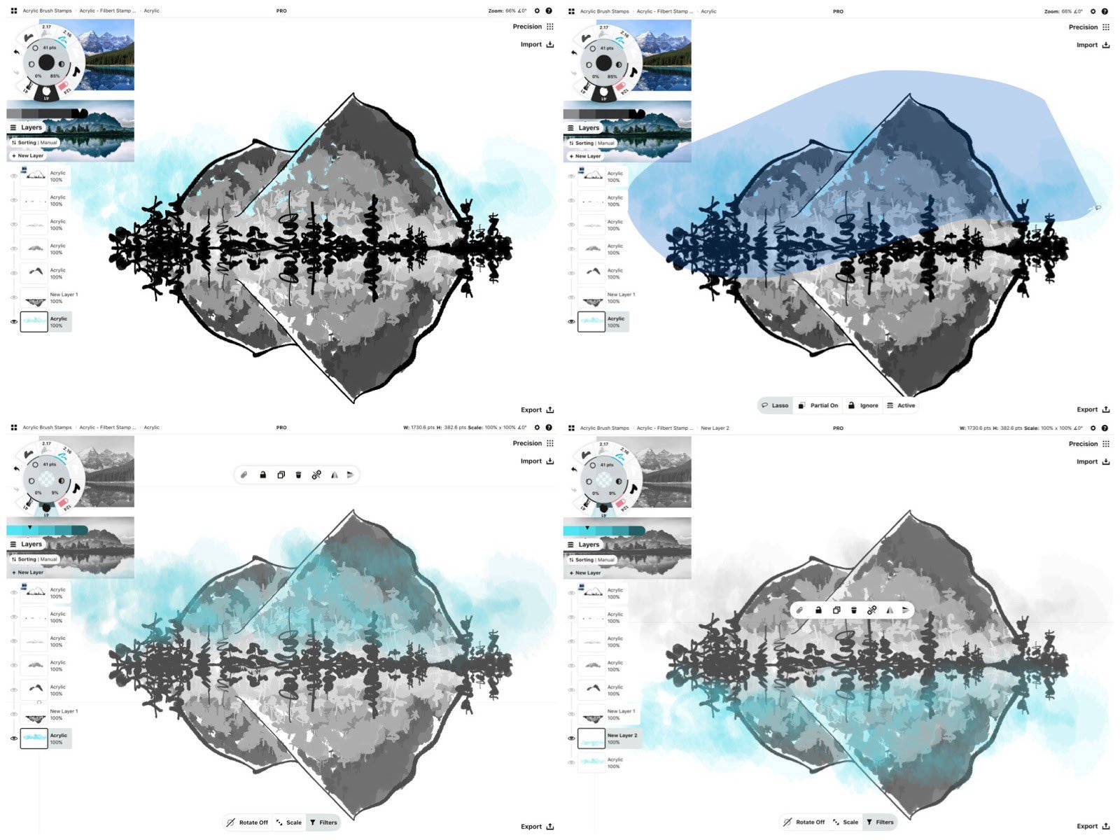
6. I changed the color to white and added paint behind the mountain to block out the sky showing through. I could have just erased the blue away, but if I decided to change the canvas color it would show through, and I liked how the white became a highlight on the mountains.
With the same white brush, I layered more white onto the outer edges of the sky and water separately, to give them some uniqueness despite the reflection. Using white on a white background is like adding a negative to the positive paint color — it gives you a textured edge you don’t get in an eraser.
7. Then I took a large, soft eraser to the mountain’s reflection and eased it on up.
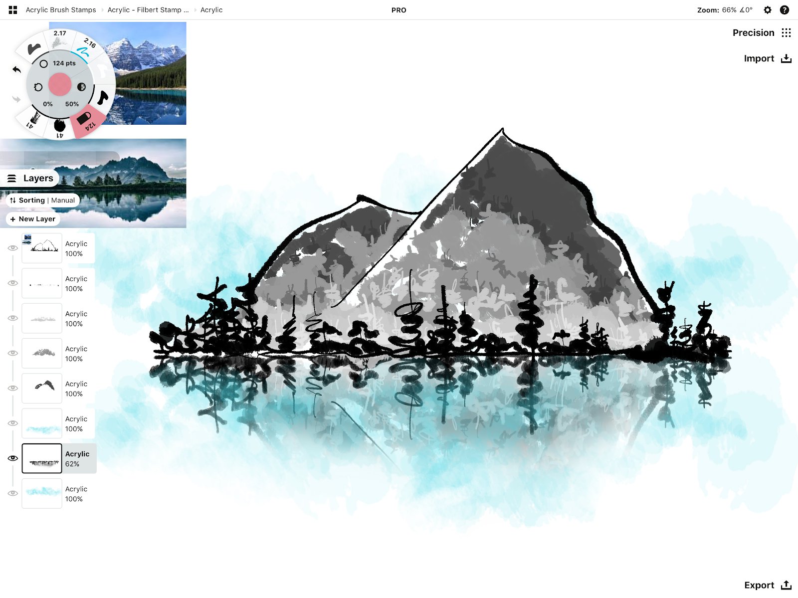
8. Once happy, I removed the reference images, added a sig and called it done.

How did your painting turn out?
Our team would love to see your work with the new brush, send it to support@concepts.app or share it by tagging #conceptsapp on social!
Also, as you experiment with the stamp images and brushes, remember that a lot depends on how you layer, rotate or scatter the stamps. Try one stamp at a time, or create several brushes with multiple stamps. You can even add a grain from a previous tutorial and try the Reveal option. Experiment and let us know how it goes!
By Erica Christensen
Recommended
How to Create a Custom Brush Stamp and Grain - Learn how to create your own stamps and grains to use with Concepts' brush editor.
Create a Photo-based Brush - Learn how to turn a photo into a custom brush in Concepts.
How to Create and Sell Your Custom Brushes - Resources for how to create, prepare, market and sell your custom brushes with Concepts App.