Concepts is an infinite, flexible creative tool for all your good ideas. Available on iOS, Windows and Android.
How to Create Photorealistic Graphics
Marcelo Cominguez shares his process and tips for creating photorealistic art.
Hi Marcelo, you are a very talented UX/UI designer and artist. Can you tell us a bit about yourself? Where you are from, what you enjoy, what has brought you to the point you’re at now in your career?
Marcelo Cominguez - Thank you for the “very talented”. I live in Buenos Aires, Argentina. I am a person who enjoys a lot of contemplation. I’m very observant, I love movies, photography, some TV series, nature, water sports, drones and science fiction among other things.
As a UX/UI designer, I love to analyze, evaluate, create and project ideas that give good results. For this, I need to express my ideas clearly, and I think graphics are the most practical way to convey ideas. The flows and sketches that tell stories, actions and ideas not only allow me to express myself better, but also make the demos more attractive and understandable for others.
Throughout my career I’ve worked for lots of different projects. Enjoy them in my portfolio, and feel free to contact me for work.
Can you give us a general explanation about your creative process? What inspires and excites you? How do you go about designing your projects?
I don’t have a muse. I read the context, time, place, my experiences, the needs of the environment, and begin to design or create based on these data.
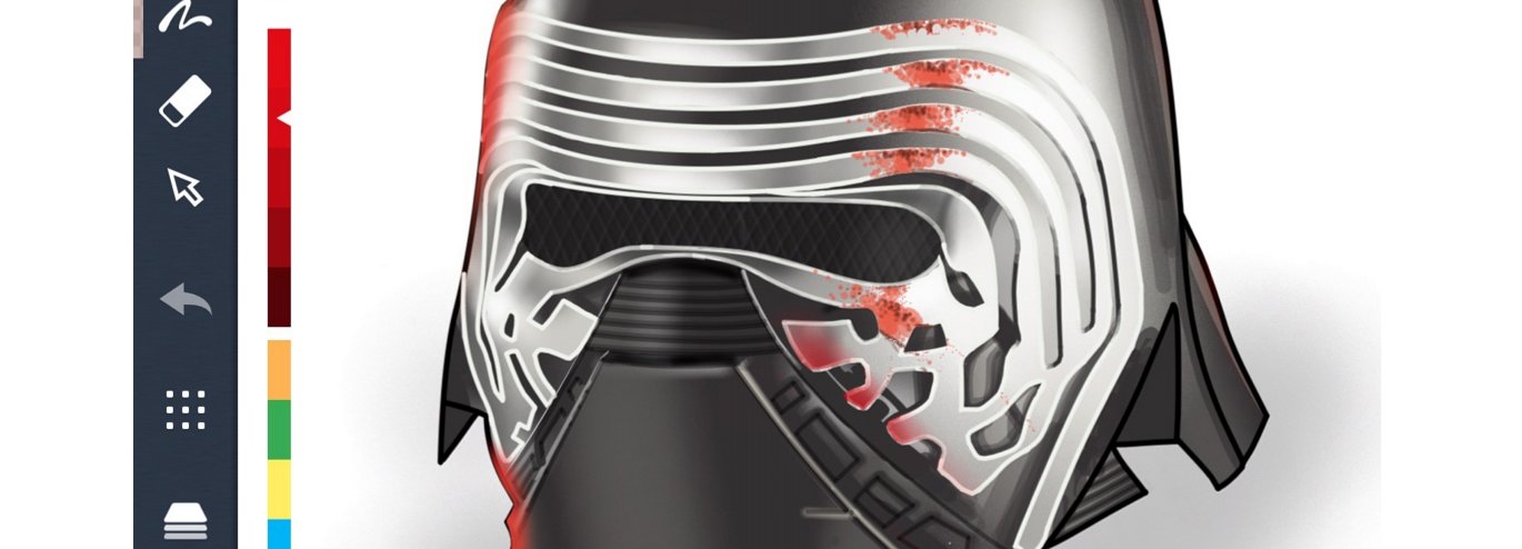
Recently you drew a fantastic Star Wars helmet using the Concepts app. Can you walk us through how you made it?
Actually, I am applying my knowledge from real tools to digital tools. The rulers, airbrush, pencils, markers and brushes help me to project a drawing. Before starting, I imagine how to achieve each effect. These are the steps I used to draw Kylo Ren’s helmet.
First, I select the right tools for this drawing. My intention is to make a drawing of photographic style.
Essentially, I use the airbrush to generate variations of soft shades as in the real world. In the real world we do not often see flat colors. The light bounces and affects in different modes depending on the environment, the place of the light focus, and the point of view of the observer.
Before starting each stage I create a new layer, this allows me to use the eraser as a mask without affecting the rest of the drawing.
1. Draw the contours delineating the figure with the pencil.

2. Demarcate areas of brightness where the light is reflected. These are guidelines for use later.
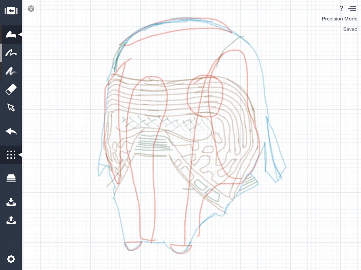
3. In a new layer, with the pen in Precision Mode, I draw new lines overlapping the pencil lines for the external contour of the figure.

4. Then I do the same with the inner lines in different colors, each color in a new layer.

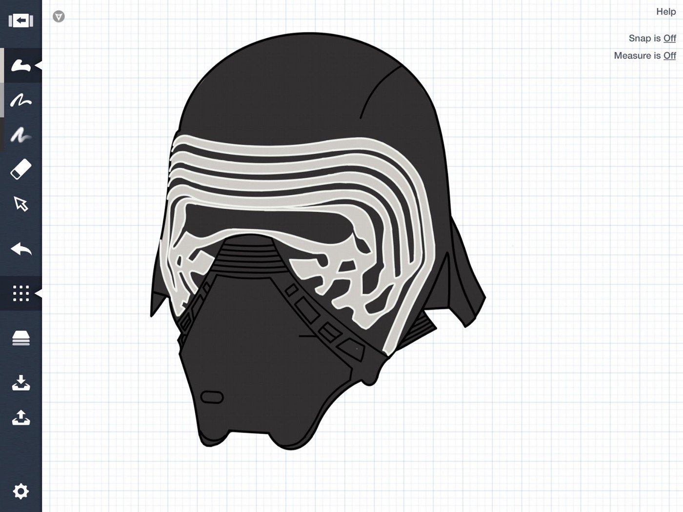
5. With the Filled Stroke tool and the appropriate base color in another layer, I demarcate the contour of the figure outside of the pen limits (drawn step 3).

6. I use the Eraser as a mask to remove the excess and repeat the operation in the different colored areas, as seen in the lines around the helmet viewfinder. Remember to create a new layer for each step, thus the masks made with the eraser do not cover other areas.
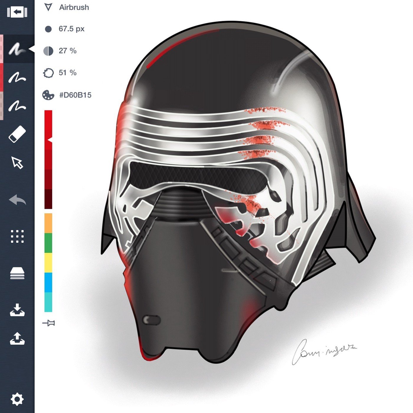
7. I move the brightness reference layer (drawn step 2) to the highest level, and apply the brightness with the airbrush using these guides.
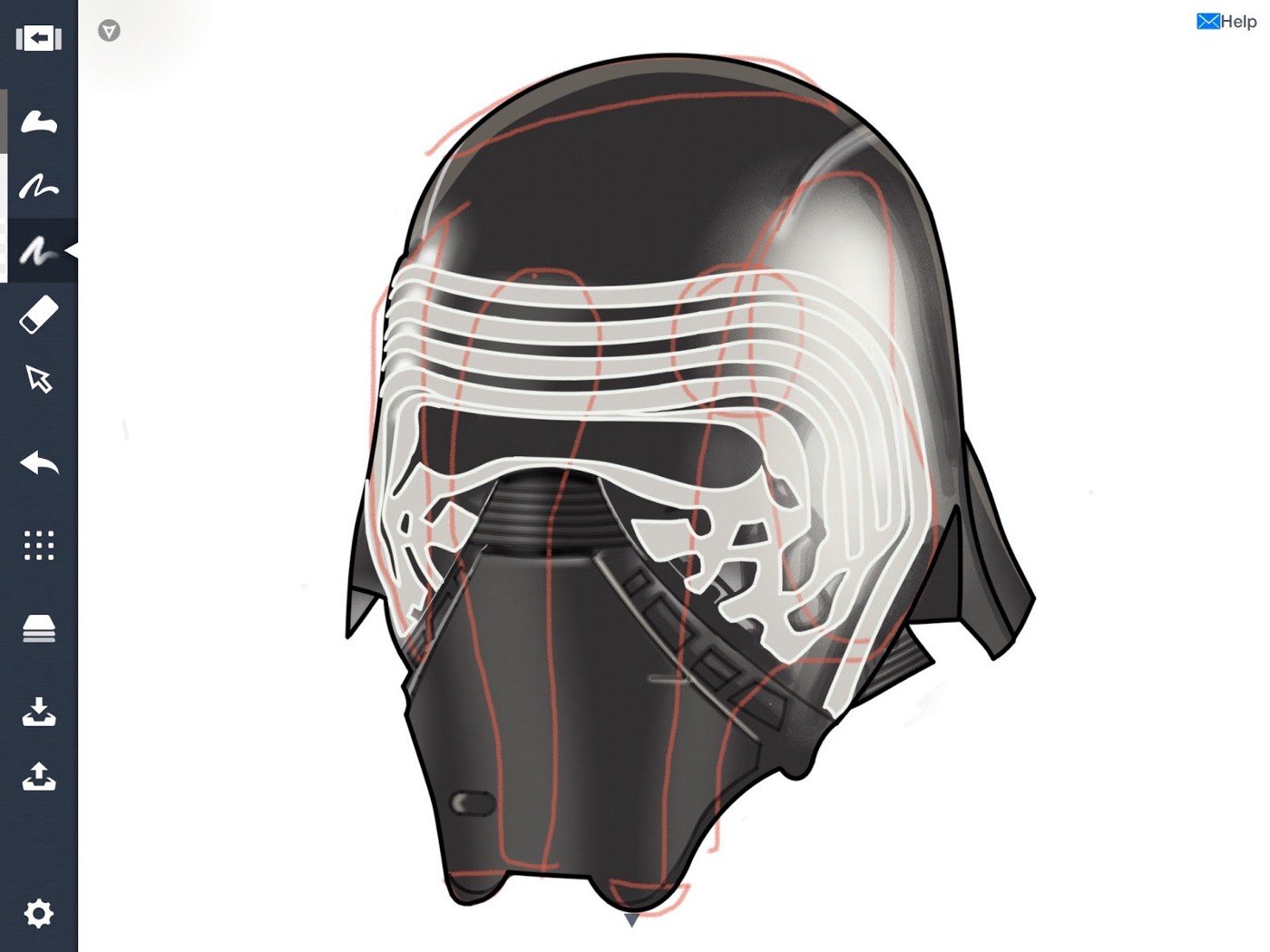
8. The brightness is also applied in different layers, sector by sector, using the eraser always as a mask to remove the excess.

9. For the details, I use several tools with different levels of thickness and transparency. To decrease or increase the level of saturation of a color, I use several overlapping layers of color in a low transparency percentage.

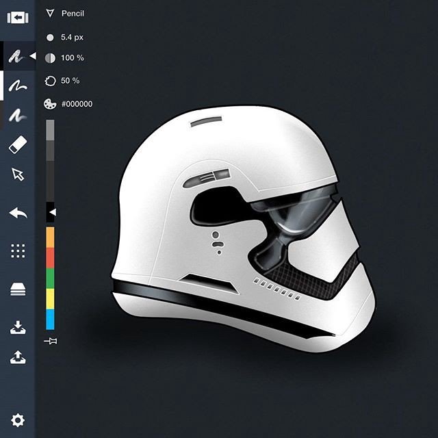
Here is another Star Wars helmet I drew using the same principles.
What is it about Concepts that you like? Do you have any tips for using Concepts that are useful to you and might be helpful for other users?
Previously, I tried other tablet apps with the same goal but Concepts is the smart choice. The UI is excellent, there are no overlapping windows, and with one hand on the toolbar and stylus in the other I can go fast. The use of shortcuts and how the color palette is displayed on screen also make work quick and easy. The precision mode helps me a lot. And it is not strictly necessary to use an active pen to work — you can do it with fingers or a capacitive stylus and obtain amazing results.
Some tips:
- Use many layers and name them in relation to the content.
- Learn the effect of every tool in its various modes, transparencies, widths, precision, etc. Then you’ll know which one to use for every need.
- Think of the eraser as a tool for masking.
- To make embossed fine lines, like the grid inside the helmet’s viewfinder: duplicate a dark line, select and modify this duplicate to a lighter color, apply some transparency, and place it slightly overlapping the original.
- If you need to use two specific colors with the same tool repeatedly during the work — for example a red marker and a yellow marker — you can add two markers to the toolbars, one in red and the other yellow. You can add the same tool several times in the toolbar and preset the modifiers to avoid having to constantly change modifiers.
Thank you for sharing your time and skills with us, Marcelo! It’s a pleasure speaking with you.
Interview by Erica Christensen
Recommended
Workflow In, Game Design Out - Designer Bart Massee shares a behind-the-scenes look at his typical game design process.
The Art and Tech of Tattoos - Read about how designer Marcelo Cominguez designed and illustrated his own tattoo in Concepts.
How to Draw Metal Textures - Learn how to use different tools and brushes to create your own authentic-looking metal surfaces.