Concepts is an infinite, flexible creative tool for all your good ideas. Available on iOS, Windows and Android.
The Layers of Architectural Design
Architect Erick Mikiten uses Concepts to bridge the art of the hand-drawn plan with CAD technology.

This article is part of a series of interviews with practicing architects who use Concepts in some part of their workflow. In each interview, we explore their design process and the tools they use to create lasting architectural designs.
- Tell us a bit about you — what you do, what your passions are, where you live/work, how you got to this point in your career.
- What is your design process like? Where do you gather your inspiration and what prepares you for creating an architectural design?
- What tools/programs do you use in your design process? How does Concepts fit into your workflow?
- Would you be willing to share a floor plan of yours and walk through how you made it from start to finish?
- Discuss the possibilities to import and export to/from standard CAD programs.
"My message to architects is, instead of picking up your sketchpad, pick up your iPad and try it. You’ll be amazed at how Concepts makes your work easy, enjoyable and organized. It gives your designs the hand-drawn touch that’s personal to you, that clients love, and it bridges you simply with the digital world. It’s worth it."
Erick Mikiten - I’ve had my own firm for 25 years, with one foot firmly planted in hand drawing, the other foot in tech. I worked for other firms in Texas, Los Angeles, and San Francisco after grad school, and the moment I had enough hours under my belt to be eligible for the licensing exam, I quit, got a job teaching, gathered projects and started Mikiten Architecture in Berkeley.
I used ArchiCAD 3D BIM (Building Information Modeling) software, became a reseller for it and created a software package add-on to ArchiCAD, basically an organizational one with preset templates and so forth. They bought us out at $2K. That was a long time ago.
I bought the iPad Pro because a couple of landscape architecture colleagues were using it with other software. I bought it with Trace and Procreate in mind mostly, Sketchbook next — I thought it was compelling that I could have that much control with the Apple Pencil. By day two, I’d searched the App Store and downloaded ten similar apps including Concepts.
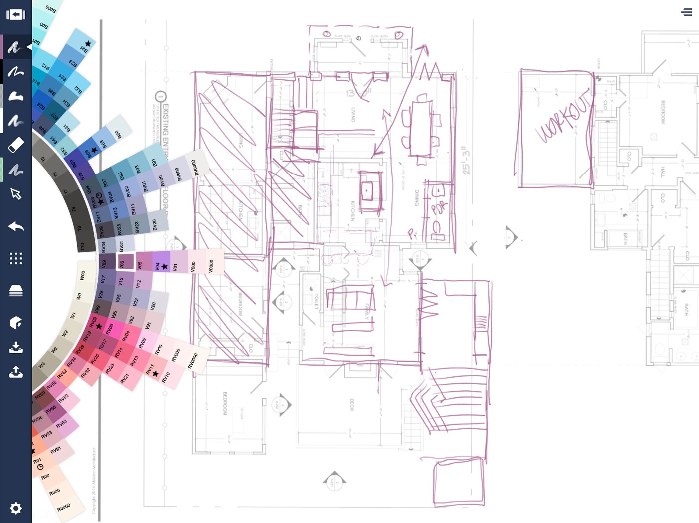
My first captivation with it was the color wheel and the Copic markers. I like those markers. My impression on the App Store was that Concepts was made by Copic, endorsed by a bigger company and not a fly-by-night sketching company like the thousands that have proliferated. I only learned months later that TopHatch is a small company, but it quickly rose to the top of 18 different apps.
I used tech support to ask a question and David answered on a Sunday morning. That support like him was always present just blew me away. That was an excellent experience and he’s been there since — we have lots of good discussions about the app.

Google Maps property image with sketch overlay
The real question is, how do you make it easier for architects — who have a fairly narrow set of goals — to get things done quickly when you’re in a crunch? Every day, you have demands — sketching, making comments on submittals to contractors, client communication — and with these demands, you have to make a choice. Sketch on the paper that’s strewn about your desk? Start working on ArchiCAD, sitting right there on your mac? Or pick up your iPad?
What I tell my colleagues is, think about picking up the iPad when you might be compelled to pick up one of the other two, because it’s easy and it’s worth it.
There are so many architects over 40 who have enough experience in quick techniques from years ago, who are not as facile with CAD software, versus the twenty and thirty year olds brought up in school in CAD, who can’t draw themselves out of a paper bag. It creates a problem in communication for us. There are principals, sole proprietors, mid and upper level architects who missed the computer revolution in some ways who would love to have a tool that is digital and flexible, but is also paper, because paper is what they know.
They freak out when they see my sketches. They have this sense of relief that maybe they are being given a second chance. These experienced architects… instead of looking over their drafters’ shoulders and verbally trying to communicate visual ideas… now they can do it themselves.
As for how I use the app, Concepts takes the place of paper for sketching. I do a great deal of sketching, and the app has the exact same feel as true sketching. It takes me 45 minutes each way on the BART to get to my son’s school. I bring my iPad instead of a sketchbook or computer. The computer takes way too much time and thinking, and less visual ability — the break-through power of the iPad Pro with Concepts amazes me. I turn smoothing on to get rid of the bumps from the train and get to work.
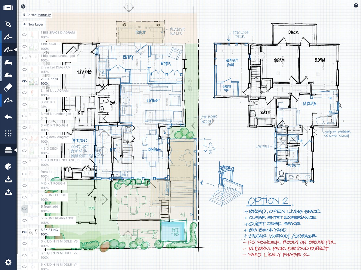
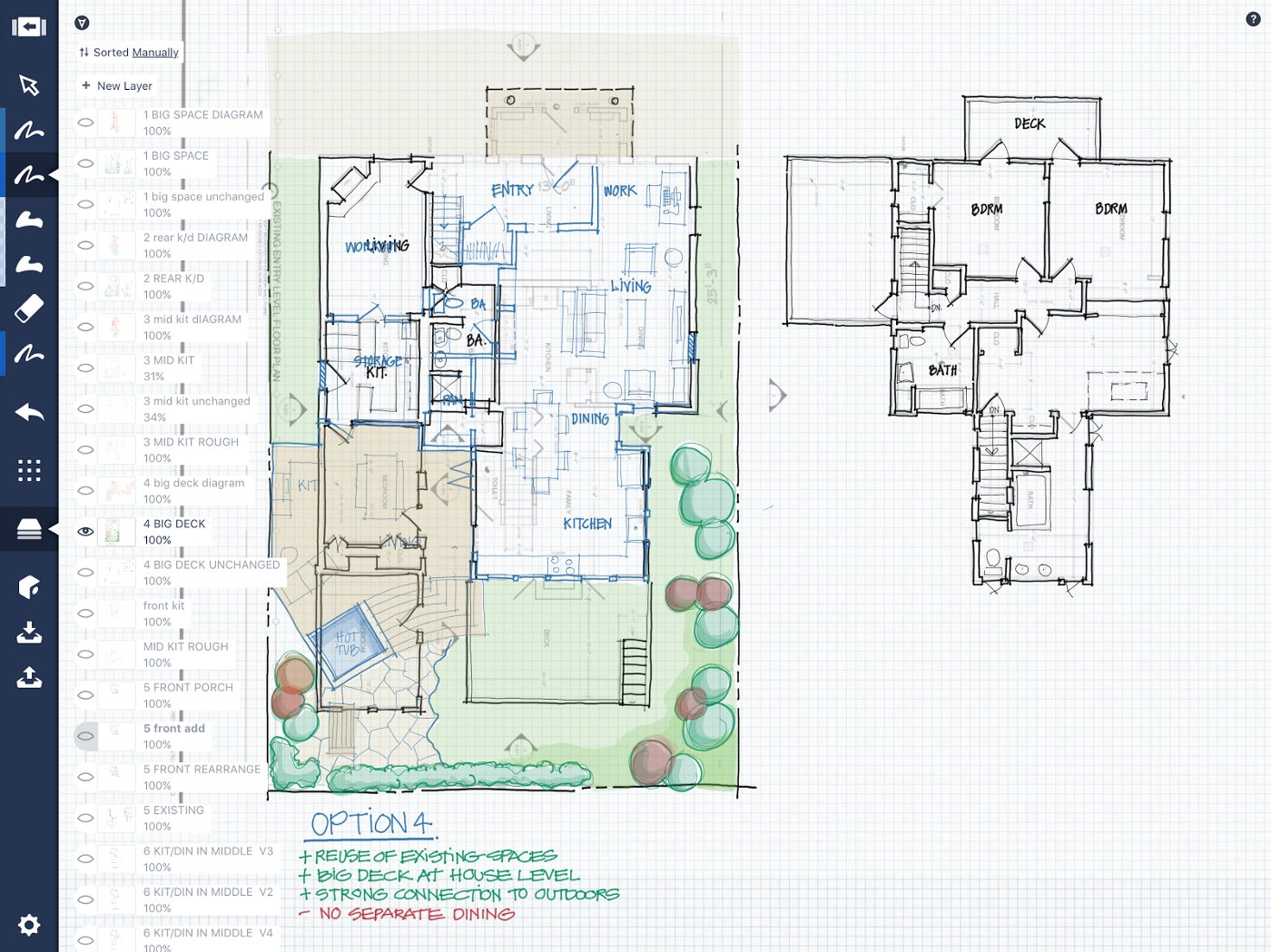
My project at the moment has 43 layers. All of these layers have different versions of a plan. I have the survey as a pdf, and over that, I trace the unchangeable structure plus notes in black. Then I have layers and layers of changes in blue. I have 70 layers for indecisive clients. Iterations are important for your clients and you need to be able to sketch effectively, and turn on and off your layers. The ability to scrub through these layers is very cool and very helpful.

Layers = Iterations
It used to be that when you were in a rush prepping a design for a client, you’d have to quickly white out the change, xerox it, trace over the xerox, scan the changes, throw on your Copic marker color, scan it again, then send it to the client.
In Concepts, you can manipulate your layers how you like them at any time. It keeps all the simple things from paper, and keeps it simply inside the app, all in one place. I’d just like to be able to work with chunks of layers, a CAD-like layer tree for groups of layers to be turned on and off with one click.
This 43-layer project was a remodel for an interior.

PDF survey import
With each project, I first import a PDF of the plan into Concepts. This is my base layer, the reference for all changes.

Rough sketching with the client
I sit with the client and reduce the opacity of the survey, and we discuss what the client is looking for, scratching thoughts in a new layer right over the top. We talk about which types of rooms are important, which walls to keep and get rid of, how we want the flow of the home to be, and so forth.

Unchanging structure
Once I have a rough idea of what we’re going for, I make a new layer and trace over the unchanging walls in black ink — the basic structure we’re not going to touch.
In another layer, I add what’s new in blue ink. Over the course of our discussions, we draw as many iterations as it takes.

Dining in Front

Rear Kitchen

Central Kitchen / Dining
One of the important discussions the clients and I have is about flow. How do you imagine living inside your home? What are the living areas? What is the transition like between the indoors and outdoors? I flesh in the landscaping to give my clients a feel for their space.

Option 1

Option 1 with Flow
We list the pros and cons with each option.

Option 2

Option 2 with Flow
One of the things I appreciate is the way I can manipulate layers, so the client and I can discuss the plans with a nice, clean interface. I turn the base layer off to declutter the view, then lower the opacity of my plan and sketch in the home’s flow.

Option 3 with Survey

Option 3 without Survey

Option 3 with Flow
We continue discussing layouts.

Option 4

Option 4 with Flow
As we settle on a desired layout and discuss details, it helps to sketch what the rooms will look like with the client. I zoom out on the infinite canvas and draw right on the plan.

Additional Room Details
You see a family living space sketched at the top… instead of redrawing every detail to show the clients an alternate version (with that extra shelf extending from the left), I’m able to copy the entire sketch and simply tweak it during the conversation. Very fast and convenient.
At the bottom of the plan is an example of what the kitchen would look like. Again, a fairly quick task to sketch and color inside Concepts with a pen and Filled Stroke tool. Zooming in and out, the details remain clear.

Kitchen Detail
Once the plans are decided on — additions, subtractions, layouts and budgets all considered to the clients’ satisfaction — we finalize and export them to ArchiCAD for engineering. I export high-quality transparent PNGs as reference files straight into my client’s folder in the CAD software, using Airdrop for quick file replacements when I need to make a change.
Here is a different project, but it’s a good example of how I export my images from Concepts right into the CAD software.

On-site photo imported to Concepts, lowered to 25% opacity, with sketch overlay

Image integration with ArchiCAD

Full image reference inside ArchiCAD

Landscape Concept
At the end of a project, I take the plot map and trace over the existing conditions, showing the setbacks for required side yards, and meld the architecture with the landscape. I give this concept to a landscape architect, who fine tunes the design and works in planting and irrigation. We don’t do the landscaping ourselves, but it’s important to have a cohesive home and outdoor flow.
And then, we build it.
My message to architects is, instead of picking up your sketchpad, pick up your iPad and try it. You’ll be amazed at how Concepts makes your work easy, enjoyable and organized. It gives your designs the hand-drawn touch that’s personal to you, that clients love, and it bridges you simply with the digital world. It’s worth it.

Erick Mikiten, AIA
Architect, LEED-AP
www.MikitenArch.com
Interview by Erica Christensen
Recommended
A Journey into Architectural Design - Architect and Educator Evan Bronstein shares his creative process and thoughts behind designing for the future.
How to Create a Floor Plan - Everything you want to know about creating a floor plan in Concepts.
Architectural Design Tools & Workflow - Freelance Architect António Ferreira shares how he uses Concepts and other tools to go from design to finished product.