Concepts is an infinite, flexible creative tool for all your good ideas. Available on iOS, Windows and Android.
How to Design a Stained Glass Window on iPad
Artist Erica Christensen shares how she designs a stained glass window pattern with Concepts.
Erica Christensen - What does “light” mean to you? Easy to lift? Where are my sunglasses? Life-giver?
For me, it’s the power to transform. What carries light captures the eye, makes the mundane interesting, brings new dimension. And any medium that invokes this emotion of growth must be explored — because it makes me change.
For this reason, the idea of working with stained glass has played at the edges of my psyche for a long time. You can see me pouring over YouTube tutorials online, visiting displays in art museums and curio shops, even waylaying and interviewing this wonderful man about his glass handling techniques on a family road-trip to Nova Scotia. I came away with this beautiful Canadian maple leaf as a treasured souvenir of our visit.
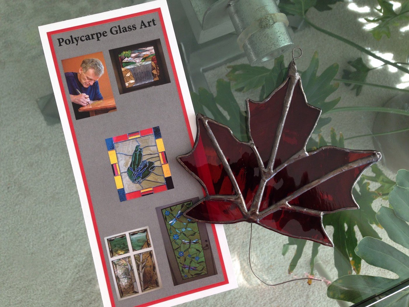
But I never dived into the art because too many things prevented me. Where do I get the materials? Do I have a workspace where the kids won’t get glass in their feet? How in the world do I solder… will I burn my house down??? And let’s not mention the limited budget to spend on copper foil, glass and a grinder, which I spent on paints and vellum paper for my own experiments with light and transparency.
Do you ever feel this kind of start-up friction in your own life?
At last, I’ve taken a deep breath and made a list of items to tackle to make the fascination a reality. In this tutorial, I’ll share with you Step 1, creating a stained glass window template — using the prime tool I use for planning all my projects, the design app Concepts: Smarter Sketching — because sometimes, the hardest part is finding the right spark to set you on fire.
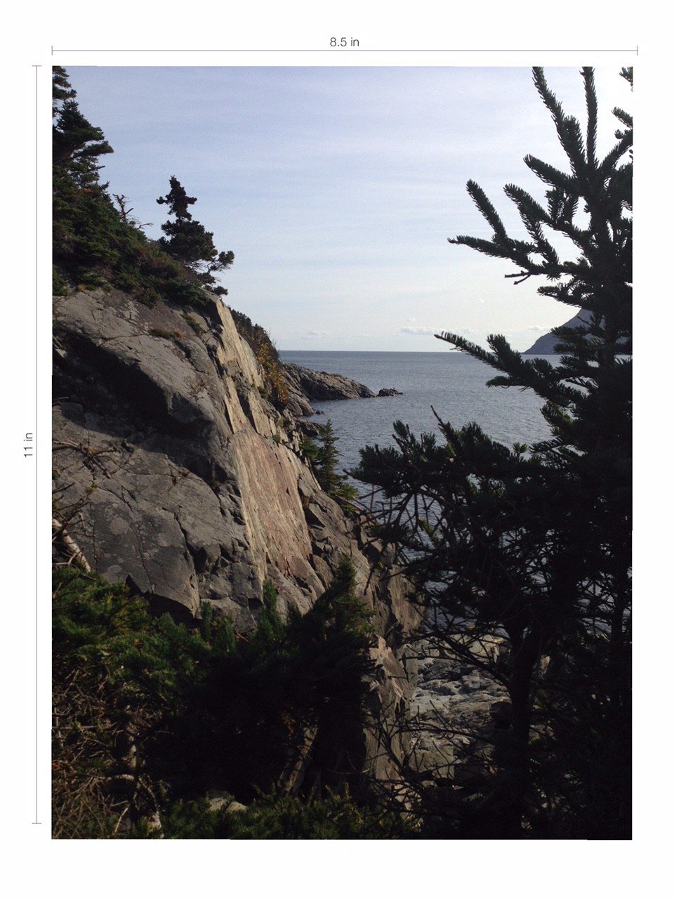
There are a number of lovely stained glass templates you can find online but I wanted something meaningful to me. I love this photo capturing the essence of the Nova Scotia coastline, so this is what I’ll turn into a unique, ready-to-use template.

I open the Concepts app and consider the parameters of my project so I know how to preset my settings. How big will the window be? Do I use metric or inches? I settle for inches because the copper foil and lead casing (called Came) come in standard 5/32” and 7/32” respectively. I also decide to make it easy and print my template at home on a standard sheet of 8.5 x 11” paper.
I open the Settings menu. A couple ways to set the template boundaries come to mind: use Precision Mode and a rectangular shape-guide set to 8.5 x 11”, or set the paper size to 8.5 x 11”. Either works.
For the first, you can tap Precision Mode and select the Rectangle shape-guide. You can expand the rectangle with your fingers and watch the numbers go up or, my preference, do it instantly with a tap-and-hold. Tap-and-hold each number and a screen will appear with a keyboard, where you can type the exact measurement and choose the metric. Enter 8.5 inches for the upper boundary, 11 inches for the side boundary.

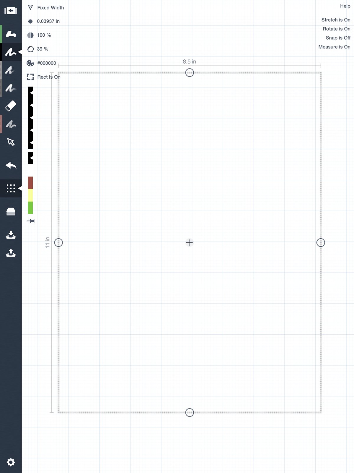
Afterward, you can tap the new measurement and the app will “set” them, so that when you Export your drawing (in Precision Mode with no shape guide selected), they will remain on the export. Handy for all kind of plans and blueprints.
The second method is to go into Settings and under Paper Size & Scale, touch the W x H box, select the US Paper option, and choose 8.5 x 11 in. Check that your Scale setting is 1:1. This will differentiate your paper size on screen so you can see exactly where the boundaries are, and when you export it as “Configured Size” at the end, your printer will print the exact dimensions.
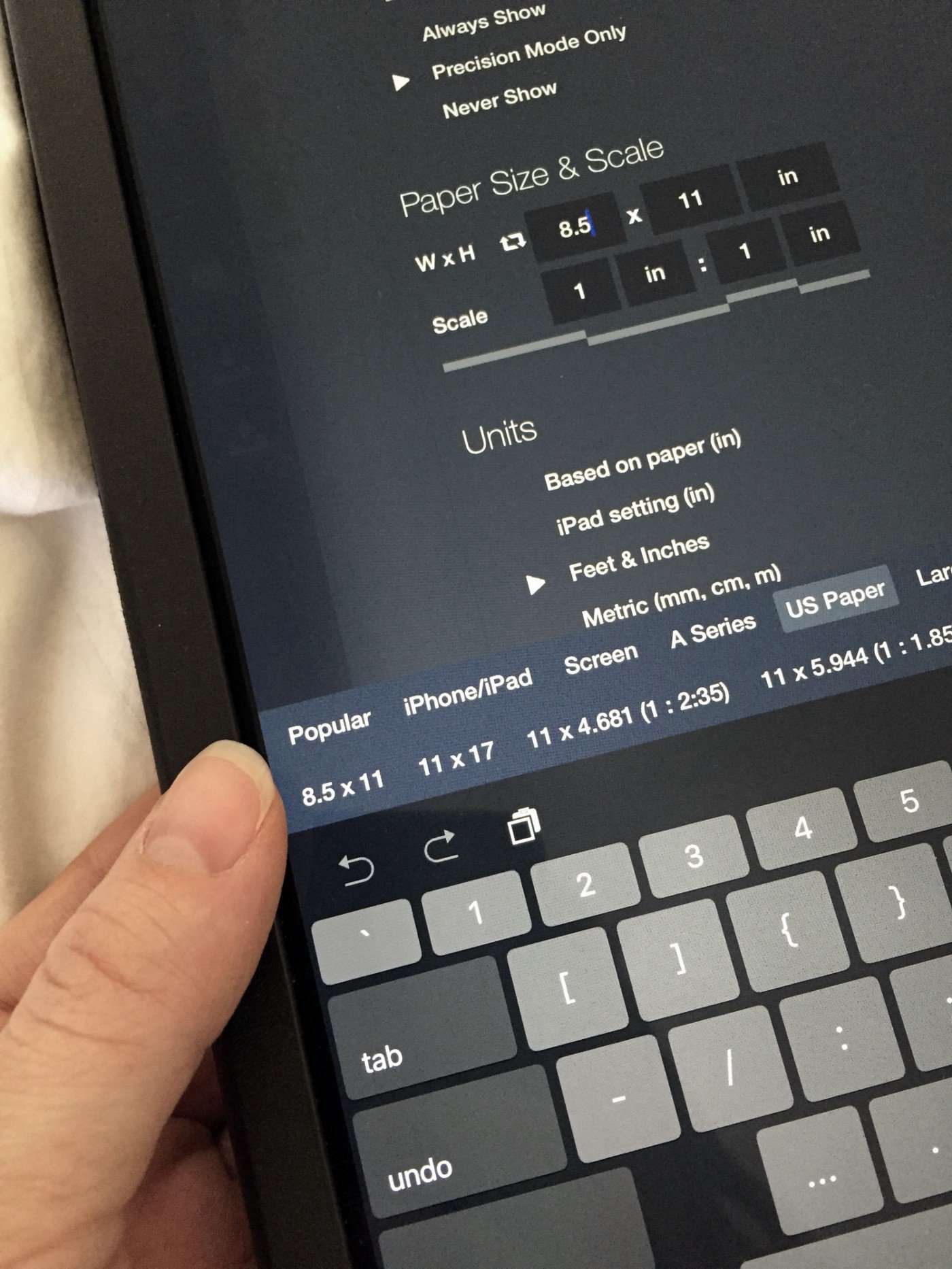
I go with the second option for this project and my paper appears, ready to go. I touch Import on the toolbar and select my picture from the photo library. I size and place it so the picture is exactly how I want it inside the boundary. Love those cliffs!
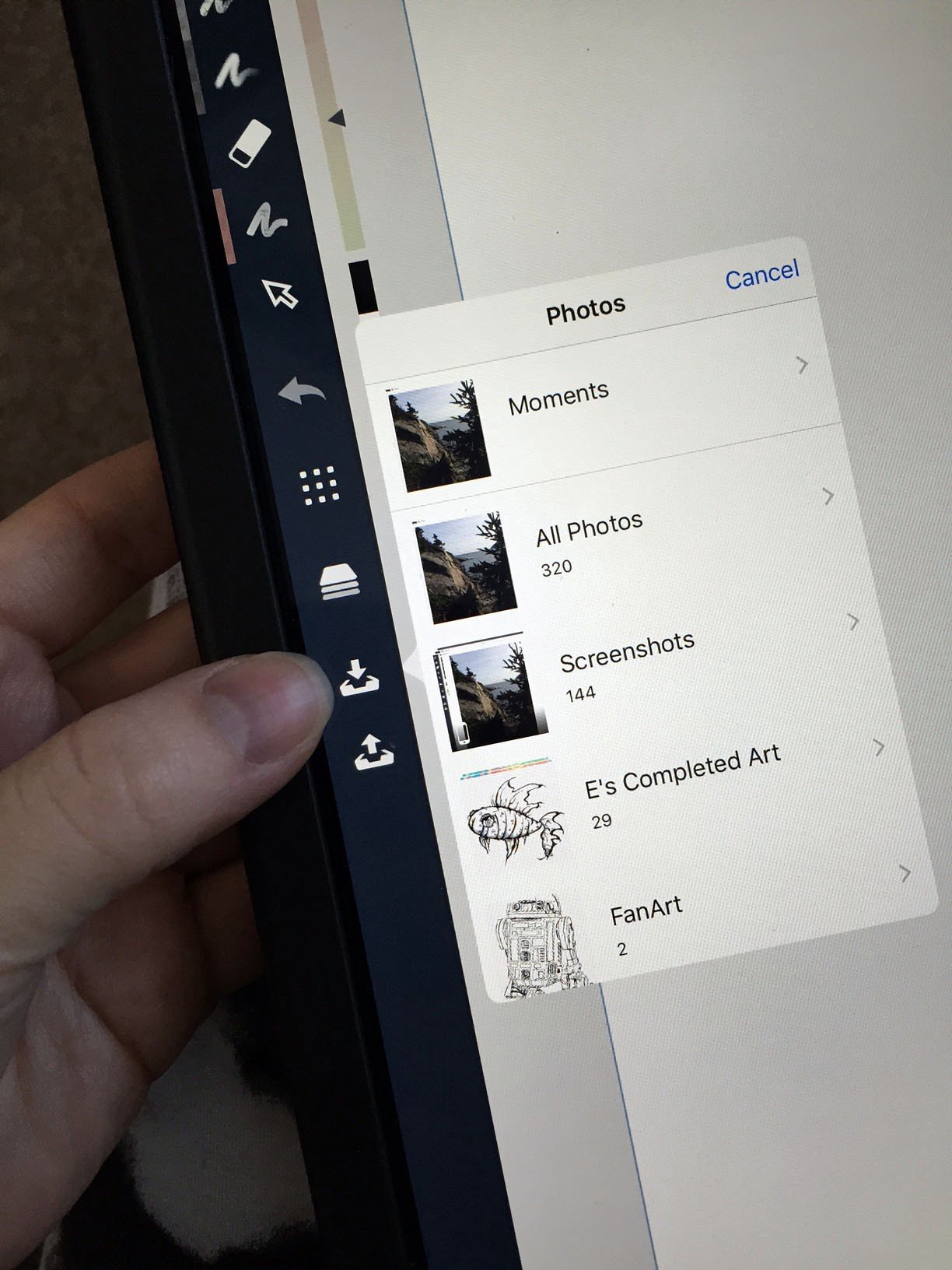
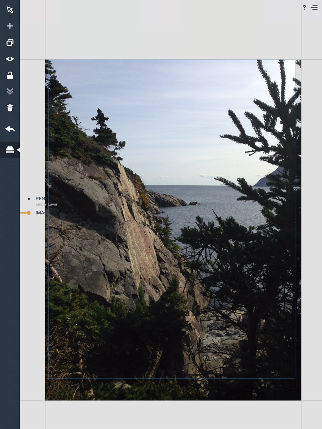
For drawing the lines, I select the Fixed Width Pen and by tap-and-holding the pen size, enter in 1 mm — the size of a felt-tip pen. (FYI, the Stained Glass Shears you use for cutting out your pattern afterward are 1/32”, about the same size. The scissors are distinguished by one upper blade and two lower blades, to cut room for the copper foil tape and solder when you piece the shapes back together.)
I lower the Opacity of the image so it won’t overwhelm my pen strokes…
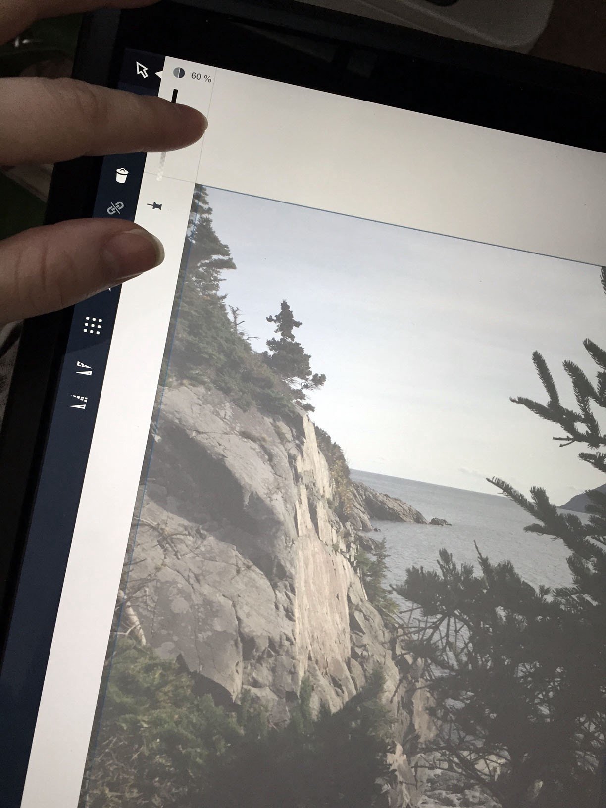
… and trace the general outline of the pines, cliffs and horizon. Glass is tricky to cut deep crevices into and I want this template to be simple, so I trace loosely. I go to the Layer view to see how it’s looking.
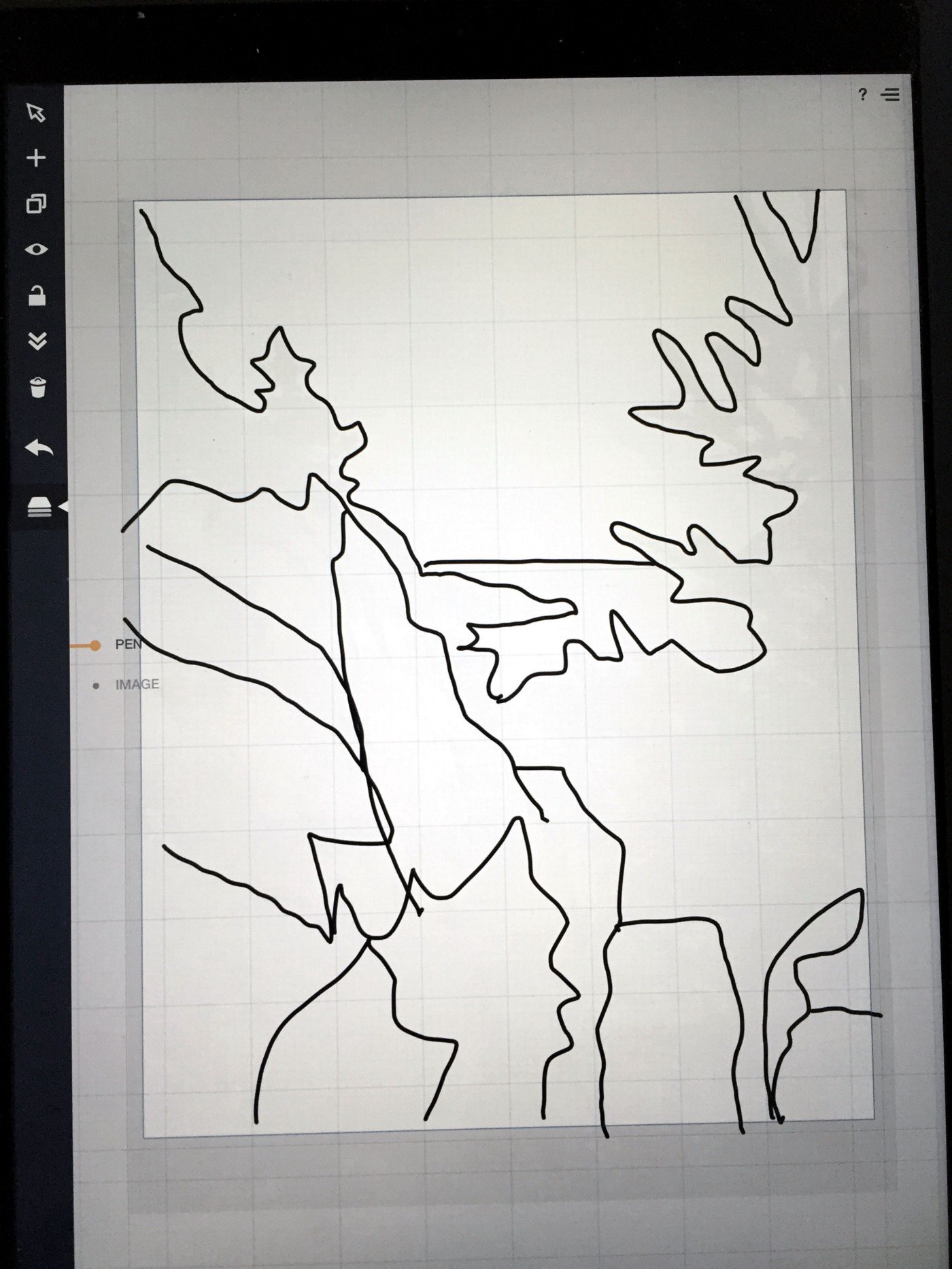
Ha, it’s a mess! But it won’t be for long.
The outline is still too jagged. I touch-and-hold the screen to trigger the Selection mode, make sure the HUD (Heads-Up Display) in the upper right corner reads “Looking in Active Layer”…
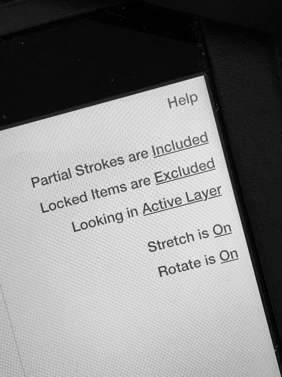
… and lasso my entire drawing. By sliding my finger along the Smoothing bar, I can smooth everything at once, from rough all the way to straight…
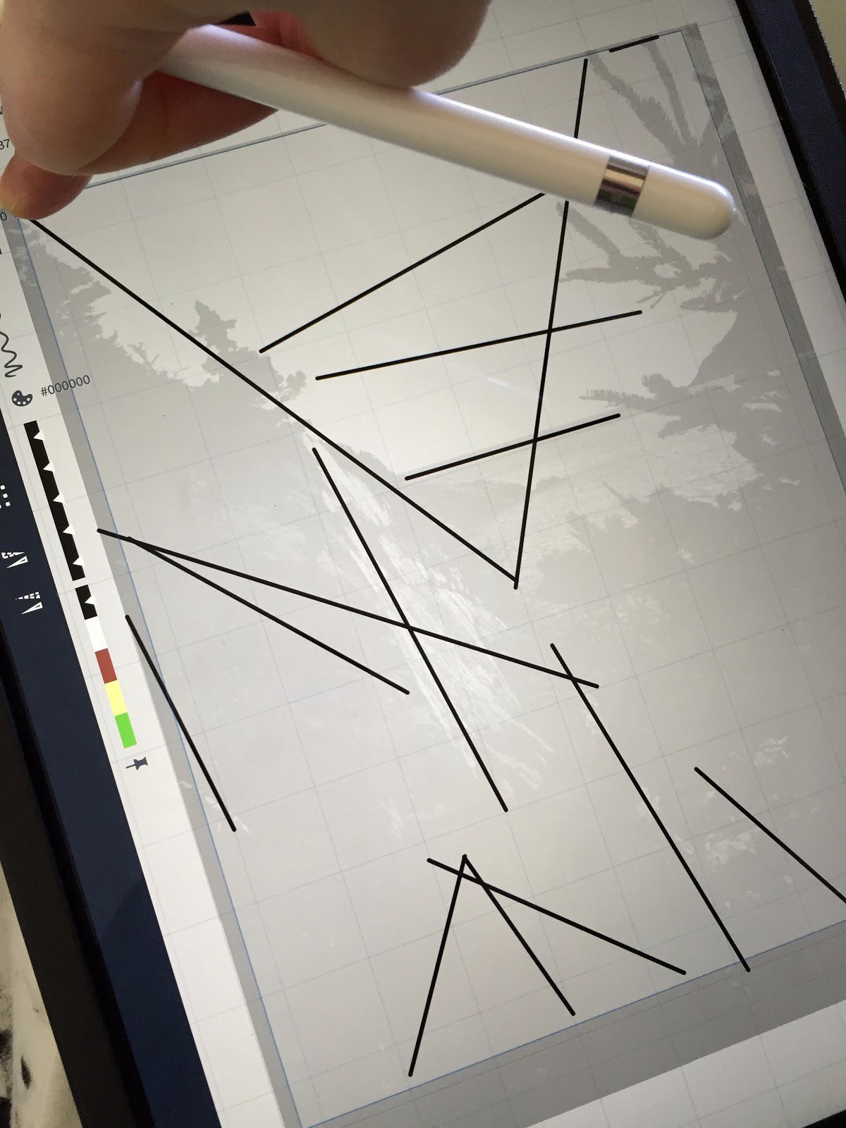
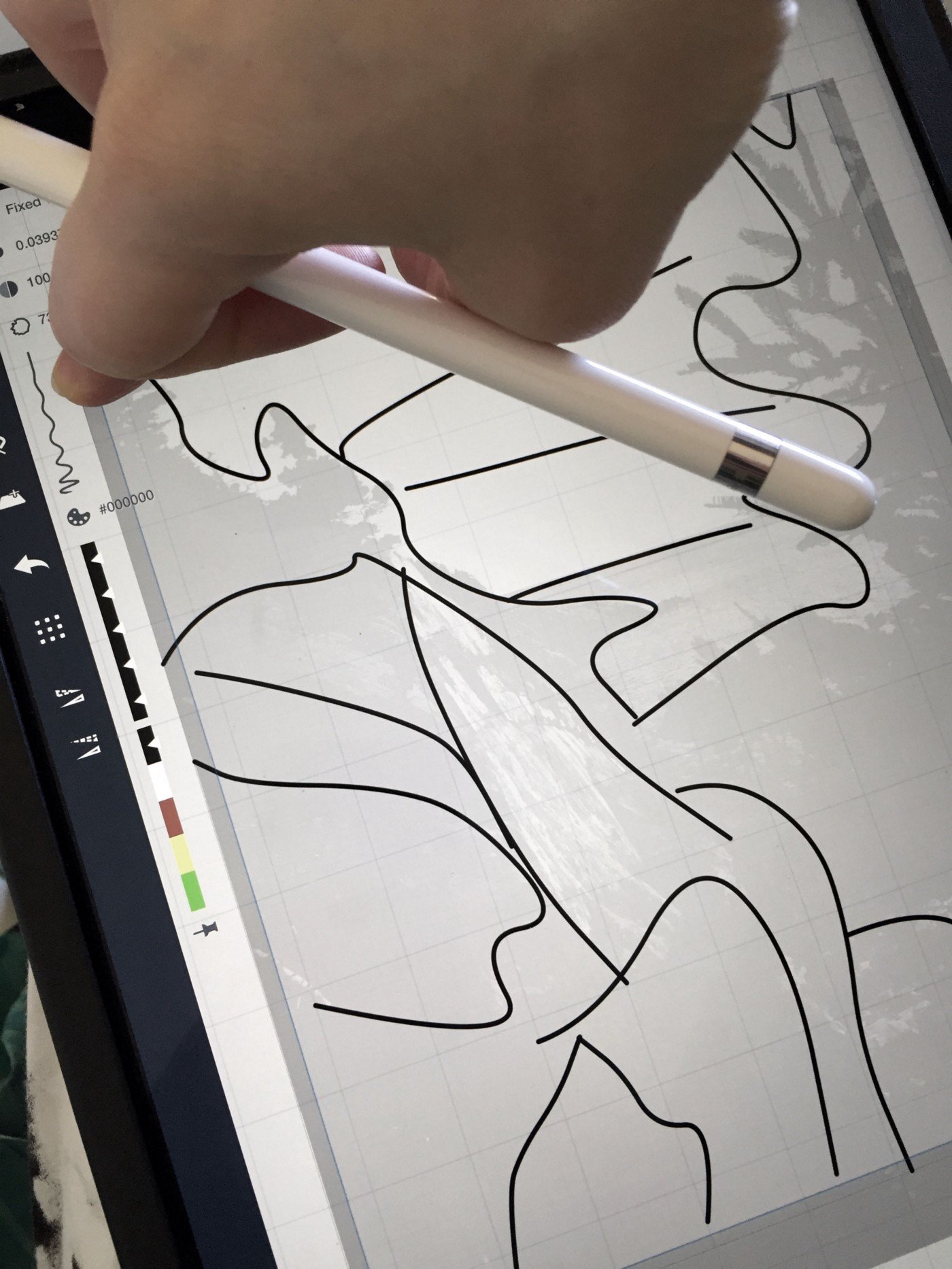
… to somewhere nice and smooth in the middle. Much better for cutting the glass later.
It’s still messy so I select lines and make adjustments until it’s all lined up prettily.

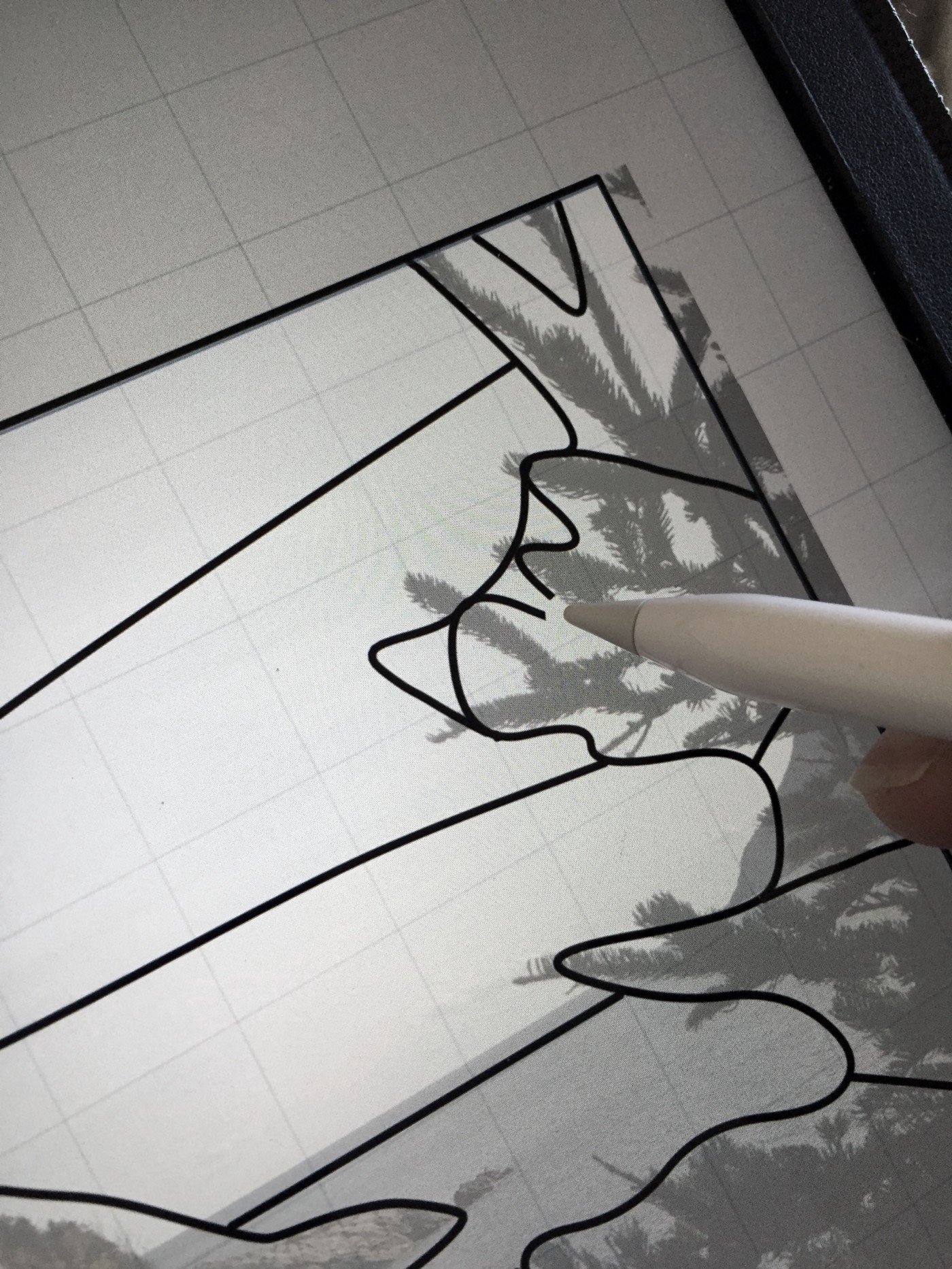
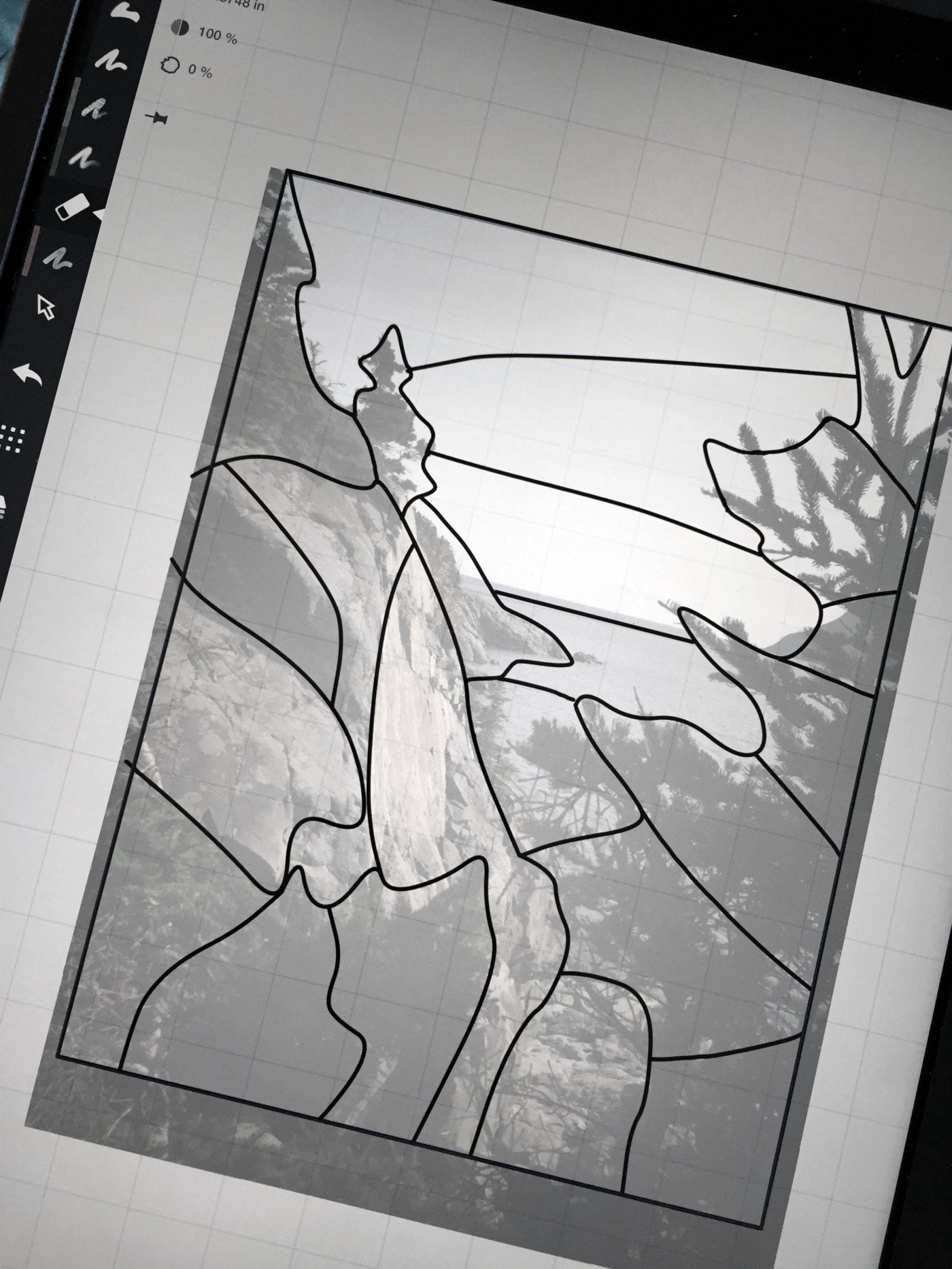
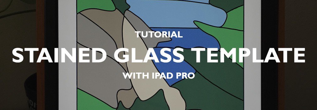
It’s looking more like a stained glass window! Now to add some color. With the Filled Stroke tool this is quick. It will give me a good idea of what colors of glass to look for, and an exciting idea of what the finished product will look like.
I add a new Layer to my drawing and position it below the Pen, so I can draw beneath the strokes and keep the lines neat. This is a totally awesome way of cheating your elementary school teacher.

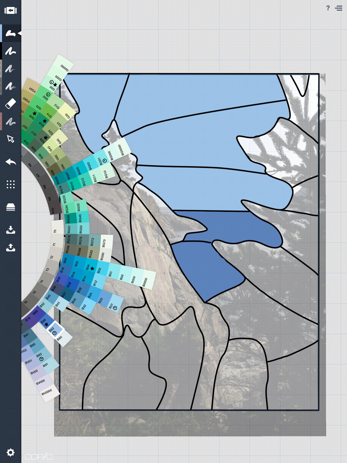
Here’s where my love for the Copic Color Wheel comes in. You can see how all of the colors come in gradients like paint chips at the hardware store — from saturated on the inside to light at the tips. If you select two colors along the same gradient line, you can be confident they’ll be complementary. I choose two blue shades right next to each other, one for the sky and one for the ocean.
As I trace the lines, the Filled Stroke tool colors them right in. I hide the image layer and take a look.
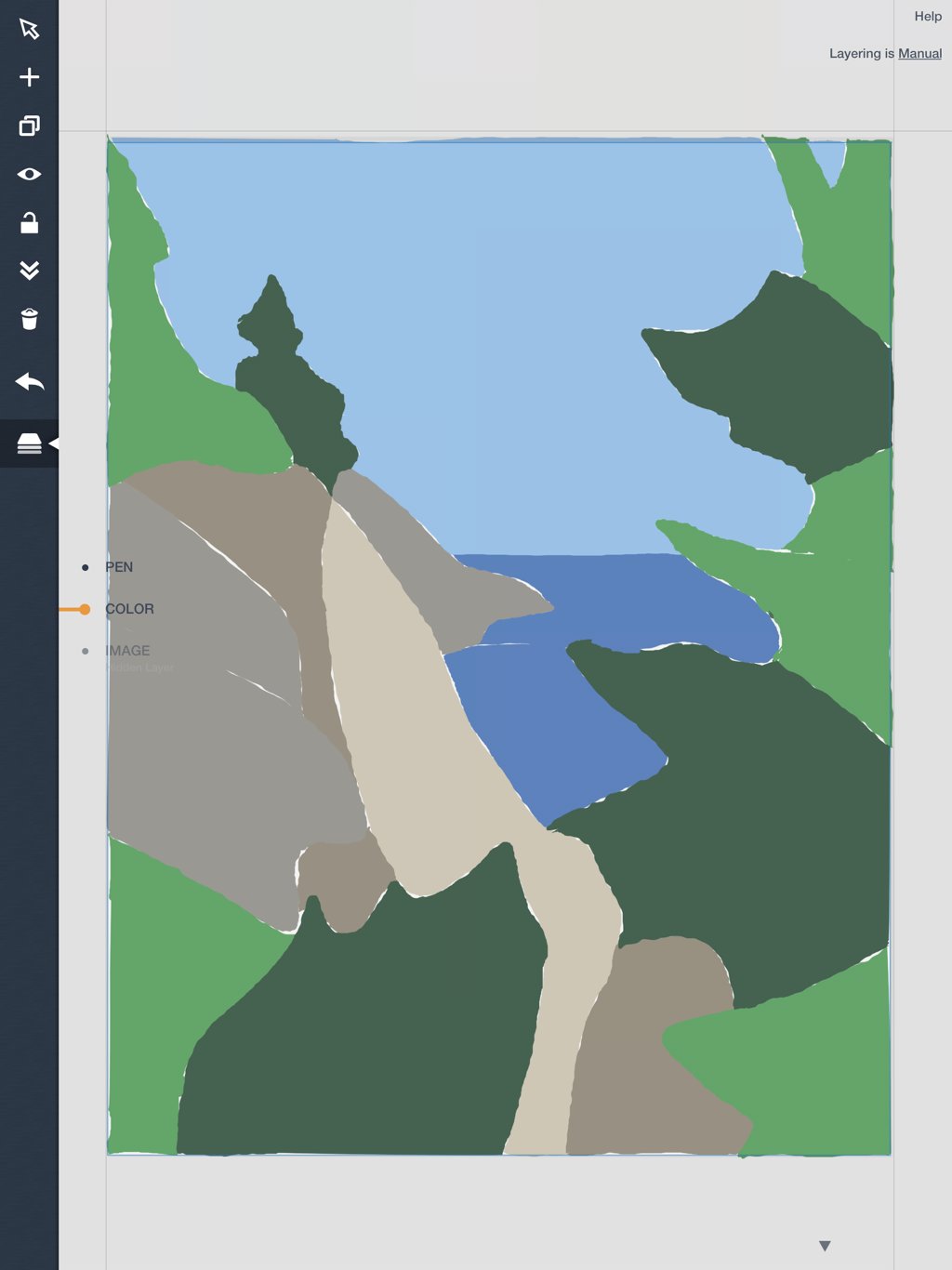
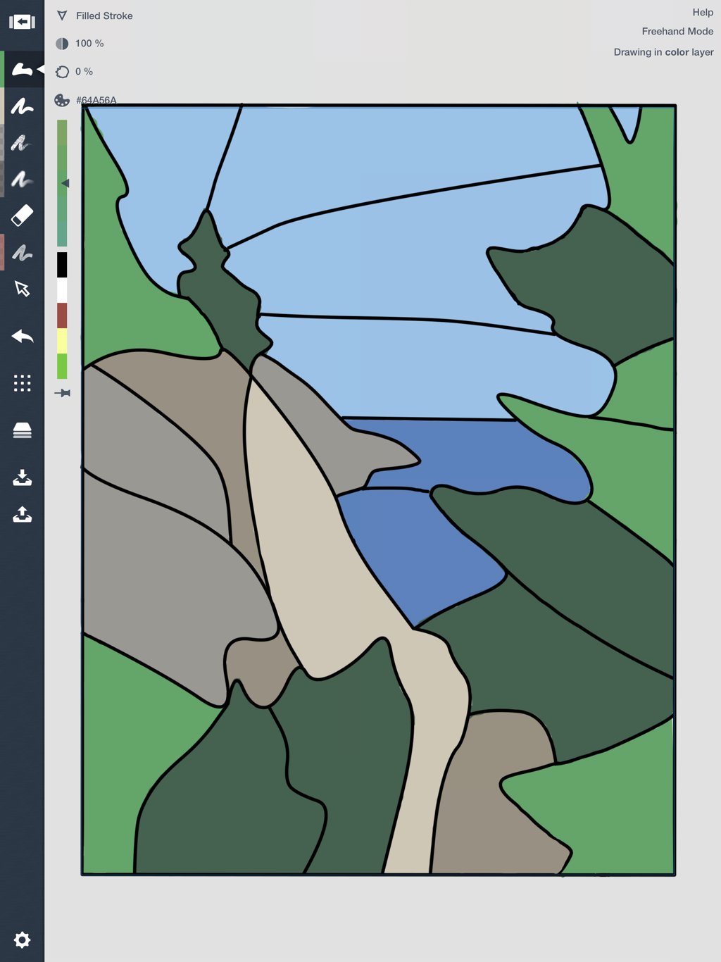
I win, Ms. Frankenburg!
The last thing this template needs before it’s ready is to be numbered, so every glass piece keeps its identity and place. I make one last layer called Numbers (then I can hide it and admire the drawing afterward without them in the way), and scrawl them in.

Looking good! My printout won’t need color, so I go back into the Layers menu and touch the All-Seeing-Eye to hide the color layer.

Time to Export. This is a low-resolution template — no sense in wasting time or ink transferring a high-res drawing to my printer — so I choose JPG and Plain White paper. Next to Configured Size is a reminder of the pre-set paper size, 8.5 x 11. This is great — it will fill the entire paper when I print, and it will be the actual size of my stained glass window.

I print out two copies, one for layout and one for cutting, and the template is complete!
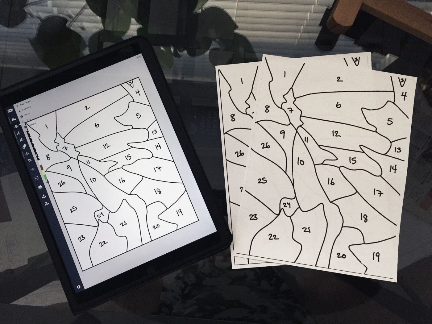
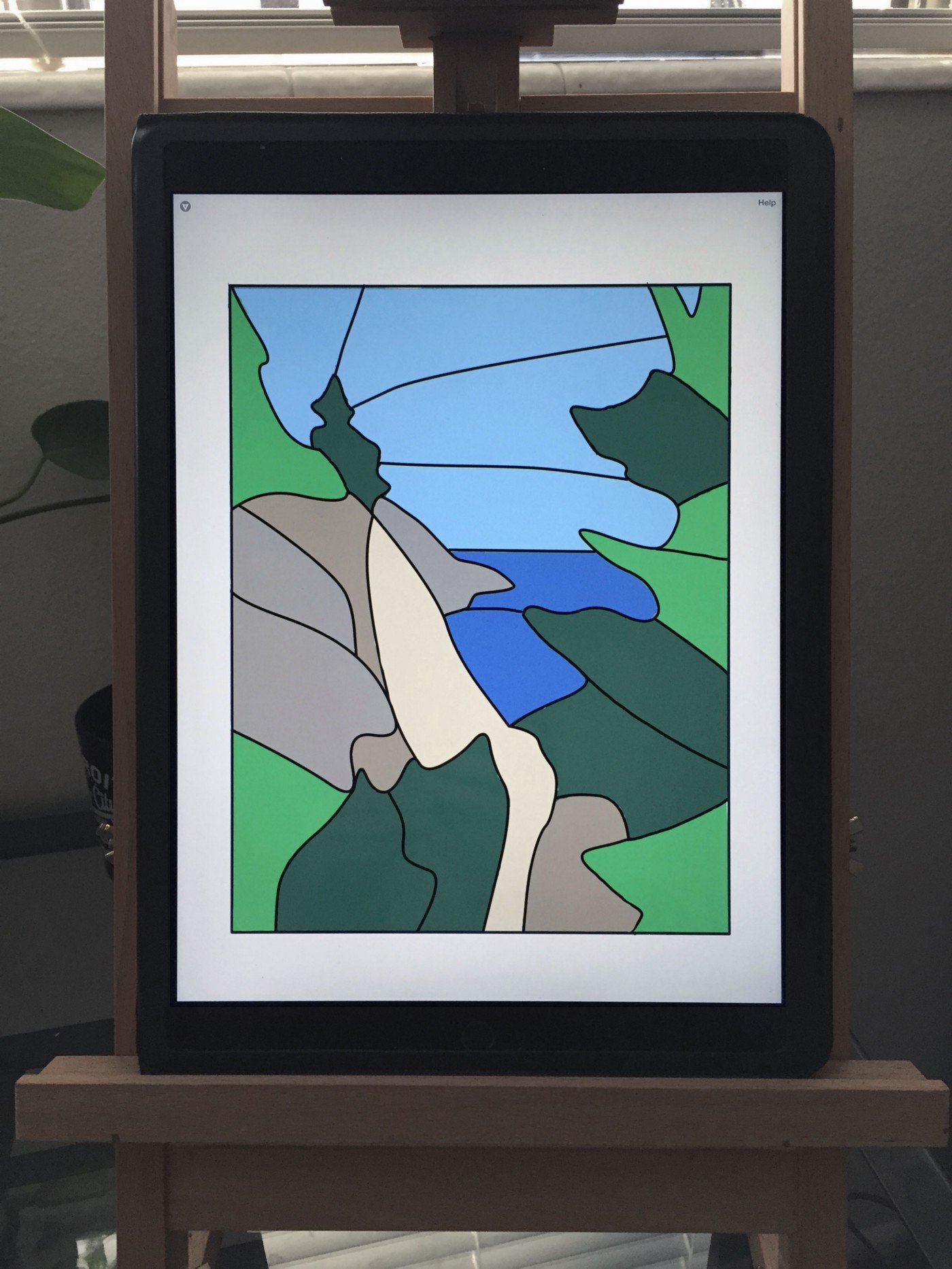
I can’t wait to get started. But the color version looks pretty good on my iPad, too.
For next steps in crafting a stained glass window, please take a look at this video, How to Make a Stained Glass Window Panel for Beginners, by TheArtfulness. There are many out there, but this was the most informative, tip-filled tutorial, and I appreciated the gentleman’s pace and attention to detail.
If you have any questions or comments, or just want to share what you've created, you can do so by sending us an email at support@concepts.app or by tagging us #conceptsapp on social. Thanks!

Erica Christensen is the Chief Writer for the Concepts team, and a freelance writer and illustrator. She has sold her art through various art markets and commissions, published art-related educational materials, and writes stories the rest of the time. The earth's ecological systems give her endless inspirations in textures and world building. She loves hiking through the mountains, and prefers to live outdoors with her notebook, iPad Pro, and flock of children and chickens. You can find her work on Instagram or her website.
Recommended
Jewelry Design with the iPad Pro - Jeweler Kate Case shares how she transforms concept sketches on her iPad Pro into intricate silver masterpieces.
Adding Color and Pattern to Designs - Artist Jill Buckley shares simple techniques for planning colors and patterns in your projects.
Discovering the Unexpected in Fashion Design - Emily Keller shares her creative journey in Fashion Design and how she creates knitwear designs on her iPad.