Concepts is an infinite, flexible creative tool for all your good ideas. Available on iOS, Windows and Android.
Draw a Cityscape
Learn to paint a detailed cityscape with some simple techniques.

I was playing around with the Concepts brushes this week and discovered a fun artistic technique for you to try. I’m sure it’s been done elsewhere, but it helped me get to know the new tools a bit better and really take advantage of their textures. Plus, digital layers give you benefits over traditional mediums, so it felt exciting, like I could explore the possibilities easily.
And it turned out very easy. It starts with a warmup flow to get you moving, and gives you three great sketches to show by the end that complement each other well. You can display them together or alone.
Here’s what you’ll be drawing with this technique — a contemporary city sketch, an ink sketch, and a colored version of the ink sketch.

They’re not as complicated as they look. You can tell me which you like best after you try the exercise.
Thinking creatively, you could even go forest, people or creature with this technique as I go urban, following the same principles.
Let’s start sketching.
Part 1: Lines
(10 minutes)
If you look at a distant skyline — whether it has trees, buildings or people — you’ll see every element has a vertical line. Maybe because the surface of the earth is limited, or maybe because we naturally want to reach up and touch the sky… the way we grow is up.
Like this pic of New York City.

Familiar view? I took this from the observation deck of the Empire State Building.
With this idea of “up” in mind, choose a paintbrush — acrylic, watercolor, airbrush etc — and make several vertical strokes onto your canvas. Just get a feel for how the brush works. Press it, tilt it, go up-to-down or down-to-up, but go fast. This is just for warmup.

This brush is the acrylic brush we made in this tutorial. Any brush will work with this technique, though — pick a style that appeals to you.
You can set an artboard if you want or wait and set one later (I’ll talk about it at the end). If you do have an artboard, go straight off the edge of it.
Now that you’ve gotten a feel for the brush, delete those lines and we’re going to make a set of fast, varying strokes beside each other on the canvas.
Choose a light color tone for this set. It’s going to become the background layer, as true to atmospheric perspective, things fade off into the distance.

A painterly set of vertical lines.
The strokes don’t have to be even, but usually, distant crowds of buildings (or pines and people) are somewhat evenly spaced. They’re also often narrower at the top. If you have a pressure-sensitive stylus, add pressure as you pull the stroke downward and allow the stroke to get wider. It’ll taper off at the end as your wrist leaves the screen. If you don’t have a pressure-sensitive stylus, try varying the line widths instead.
Many buildings have square tops. Add lines to connect a few of the thinner strokes. Leave the fat strokes wonderful as they are.

Gaining some shape with just a few strokes.
Now create a new layer above the first one, and choose a darker version of your first brush color. Add more strokes right on top of the others. Make it random, a bit, the way they were built.

Squeeze some in.
Then create a third layer. Make the brush even darker. Not only does it give this sketch its atmosphere, it’ll help you tell the buildings apart later on as you ink it.

And that’s the whole sketch. Fast and minimalist, it represents the inner spirit or character of your urban landscape.

Here, I exported a screenshot on white, then experimented with a black background. Try it out.
Part 2: Ink
(30 minutes)
Let’s take these bones and make them into something more. We’ll stay in the same drawing, or you can duplicate it into an identical drawing if you want.
Make a new layer above the others and choose a Pen you like. I used “Brush Pen Firm”, and since I decided to keep the black background, made the pen white. I adjusted the size to be just wide enough I could see it clearly on the canvas, but not so thick it would cover my narrowest paint strokes.
We’re going to outline the paint strokes with the pen.
Zoom in on the canvas and start tracing the outer edges of the strokes, keeping in mind which buildings are in front and which are behind. Turn the layers on and off as you go to help you see clearly. You can go for a smooth line using smoothing, or keep it raw and wiggly. I felt like preserving the original paint character — made it more fun.

Next, we’ll add a layer of details to differentiate the buildings from each other and give them context.
Here, I kept perspective in mind — the square-capped buildings in front got bigger windows, the buildings behind got smaller ones. The buildings made from fat paint strokes got hash marks for a different character.
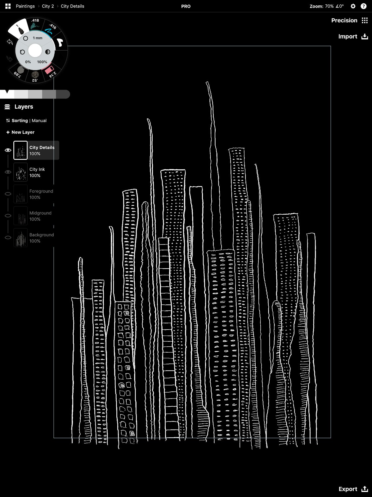
A few of the biggest windows are lit for a hint of life.
You could go with round windows or stripes or anything you want. I was thinking about the tone of the drawing — like in the New York pic, buildings tend to feel ordered and masculine, so I used marks that were fairly linear… though keeping in line with the imaginary aspect, I didn’t use rulers or anything too precise.
If you went with people, the details could be faces, hats or limbs. If you went with trees, those might get limbs, too.
Finally, as it’s a night scene, I added a scatter of stars.

Choose the details that speak to you.
Do you have your ink drawing? Let’s add one more dimension and color it in.
Part 3: Color
(30 minutes)
Wanting to add to the texture already in the drawing, I searched through the brushes for one that would speckle a bit when coloring in. After trying several, I went with the Chalk brush, especially since the black and white and urban flavors remind me of chalk. You can choose a brush that suits your mood and style.
I began with a dusky blue and colored all the same types of buildings in the foreground the same colors. The oddly-shaped towers took a different shade.

Staying neutral.
The background buildings got a darker value of the same colors. Notice I went opposite to the tonal perspective in the first drawing — it’s night so the light comes from the city itself, not the horizon, and the city has shadows further in.

Still neutral, darker in the back.
Then I brought in a couple focus points for the colors — lighter purples to encourage the eye across the scene, and a single red tower for visual interest.

Accent colors to draw your eye.
You can color in however you like. With color, everything comes down to your style and personality. Layer them in or go simple like chalk, it’s up to you.
Export Your Work
(5 minutes)
Now that we have a finished art piece, or three!, it’s time to decide how to display it. Flip between your layers to see which combinations you like best.
If you haven’t made an artboard already, this is your moment to do it. Decide which size you want your finished piece to be (postcard, 8 x 10, A4 etc), go to Settings -> Artboard Size, and create it.

If you tap a field in Artboard Size, you’ll see more options come up to choose from, or you can enter your own.
Frame your piece inside the border. Either move the artboard itself about by tap+hold+dragging on its edge, or select and scale (not stretch!) your drawing down to size. When you export, any part of your drawing outside the boundary will be cropped away, so play around to find a position you like. You might find more than one… exports are free.

The border will turn red when you’ve activated it. Drag it around the canvas to find a good frame.
Export each of your images to “Custom Size” and save them in your portfolio. Try using a photo editor app like Moldiv and combine them into a naturally complementing collage. If you haven’t used Moldiv before, they have a lot of flexibility and layouts to choose from for quick photo collages.

That’s it for this technique! How did your drawings turn out? Which do you like best?
I’d love to see your work in the comments or on social (be sure to tag #conceptsapp), or email your drawings to concepts@tophatch.com. Thanks for sketching!

Erica Christensen is the Chief Writer for the Concepts team, and a freelance writer and illustrator. She has sold her art through various art markets and commissions, published art-related educational materials, and writes stories the rest of the time. The earth's ecological systems give her endless inspirations in textures and world building. She loves hiking through the mountains, and prefers to live outdoors with her notebook, iPad Pro, and flock of children and chickens. You can find her work on Instagram or her website.
Recommended
Character Sketching Basics - Try these exercises to bring your character ideas to life.
How to Create Photorealistic Graphics - Marcelo Cominguez shares his process and tips for creating photorealistic art.
How to Draw a Mandala in Concepts - Learn how to create intricate mandalas in Concepts with this tutorial from Artist Jill Buckley.