Concepts is an infinite, flexible creative tool for all your good ideas. Available on iOS, Windows and Android.
5 Exercises for Drawing with Atmospheric Perspective
Add distance and depth to your landscapes and backgrounds with these exercises.
Artists over the ages have wrestled with the dilemma of how to capture the 3-dimensional world on a flat piece of paper. The world just isn’t flat in any dimension of the word (unless you’re a cup-half-empty person).
Paintings and treatises over time explored the effects of distance, distortion and color tones on depth, with Leonardo Da Vinci mentioning the idea of atmospheric or aerial perspective in his Treatise on Painting. The artists in the Italian Renaissance were the first to geometrically achieve perspective in their drawings, with founding father and architectural engineer Filippo Brunelleschi developing the currently used model of linear perspective.
Today, three types of perspective are typically used to bring depth to drawings: atmospheric, color and linear. Stay tuned for a post on linear perspective — it deserves attention all to itself. In this article, you’ll find exercises to help develop your eye for atmospheric and color perspectives.
Intro to Perspective
All the perspective types treat your 2D surface as a window called the picture plane — where you are the “eye,” viewing the world through a limited area akin to the spread of your vision.

The picture plane. (Don’t you wish you were here on Imperial Beach?)
They also suppose there is a horizon line, which represents a place infinitely opposite you where the world disappears from view. The horizon line is always straight because you’re only viewing a tiny piece of the earth’s curvature. It’s also referred to as the eye-level line, as it’s always across from your line of vision.

The horizon line. You can’t escape it.
You can be above the horizon line, making the world seem smaller, or below it, making it appear grand.
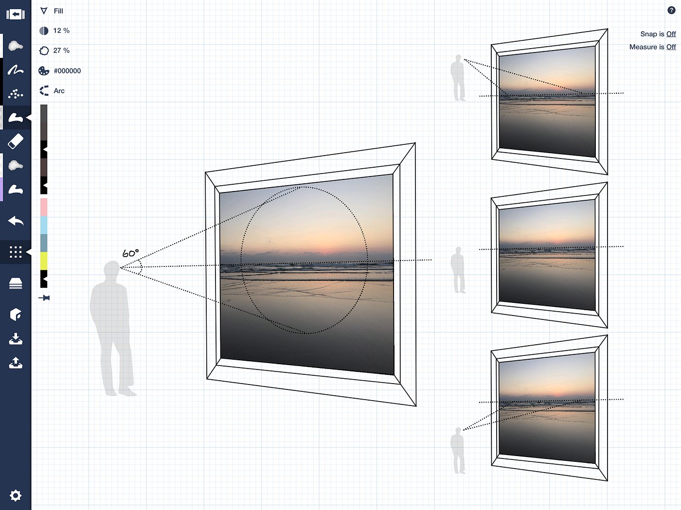
Cone of Vision. Where you look is where you’re destined to go.
To prevent your image from appearing distorted, as happens at the edges of your vision, the focus of perspective drawings are kept within a 60 degree radius, aka your cone of vision.
Atmospheric Perspective
Atmospheric perspective takes into account the density of the air. As you increase the distance between you and an object, the dense atmosphere between you increases as well, until eventually, all you see is the air or sky in the far distance.
This effect causes light and dark values to appear most extreme closest to your eye, and the value differences to decrease as they fade into the distance.

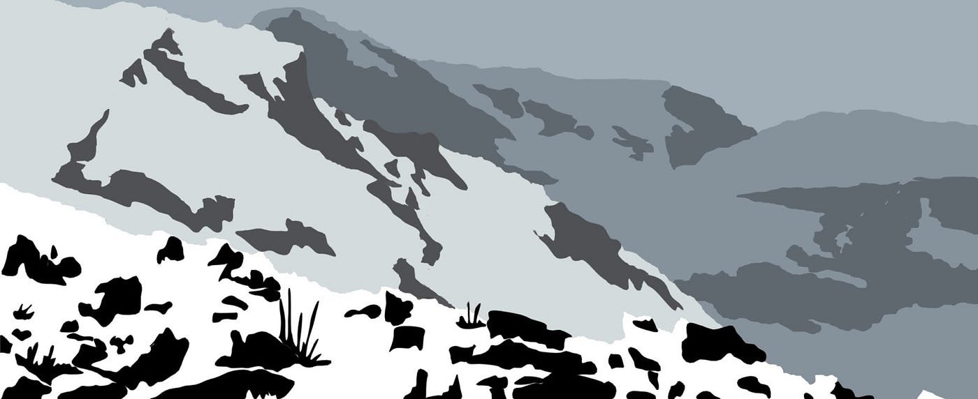
Atmospheric perspective seen off the saddle of Mt. Timpanogos in Utah.
Exercise 1: Color a Landscape
- Download the following landscape. (The CPT file has both a black and white line drawing and the original image in separate layers.)
- Color it using light and dark extremes in the foreground, mid-range tones in the center, and fade into the blue atmosphere in the background.

You can hide this line layer when you’re finished coloring, if you’d like.

An example using gray tones. Notice the extremes in the front, and the decrease between color values as you recede through each area. Also notice the shadows fall to one side.
Another variation on showing atmospheric definition comes from applying the idea that things seem smaller the farther away you are from them. By using thicker line widths in the foreground and thinner lines in the background of your drawings, you can represent fading detail.

Notice the amount of detail stays the same, but is thinner and smaller. Original photo taken at Meadowlark Gardens in Virginia.
Exercise 2: Ink a Landscape with Varying Pen Widths
- Take a photo of a place near you.
- Import it into your app and capture the nearest, most important details in the image with a thicker pen width. Use a medium tipped pen to show mid-ground and a fine-line pen in the background to represent increasing distance.
- Or, download this image and experiment with various pen widths to affect the depth.
A similar approach is to focus your detail into just one, significant area. In photography, this is called depth of field (DOF), referring to the way a camera uses a single focus to capture the detail in one location and blur the surroundings.

Poppies in detail, with the background blurring out.
Exercise 3: Focus Your Detail in One Area
- Download this image. (The CPT file has both a black and white line drawing and the original image in separate layers.)
- Take time to color the nearest, most important details sharply. Use the Fill tool for perfect edges, or use watercolor or marker with the eraser tool as a mask.
- Apply the background colors in a blur.
- Go ahead and hide the line layer to show off your color effects.

All the focus is on the blossoms, but it wants a bit of context.
Color Perspective
Color perspective also takes the tone and density of air into account. Colors are warmest closest to you, and as the colors of the atmosphere are added into the tonal scheme, they gradually cool into the distance.
Here you can see the warmer hues of yellows and greens in the foreground, and how they fade into the blue atmosphere in the distance.

Color perspective in Summit Park, Utah.
Reverse color perspective occurs at sunrise and sunset when the atmosphere is warm-toned, and by contrast, the air beside you is cool.

Reverse color perspective on Imperial Beach in California.
Exercise 4: Color a Landscape with Warm Fading to Cool Tones
- Download this landscape. (The CPT file has both a black and white line drawing and the original image in separate layers.)
- Color it using warm colors at the nearest edge, and cool colors near the horizon line.

Exercise 5: Color a Landscape with Cool Fading to Warm Tones
- Take the same landscape and try it a second time in reverse tonality to paint a lovely sunset.
Extra Challenge:
- Envision yourself on a planet with a different colored atmosphere. What would the red tones of Mars, for example, do to your color scheme? Paint it out!
As you illustrate your own projects, consider what you learned from these techniques and enjoy adding atmospheric depth to your designs. We’d love to see your work! Share it with us at concepts@tophatch.com or tag us with #conceptsapp on your favorite social channel.
Other great sources on Atmospheric Perspective:
A basic what-is-it: http://www.arthints.com/what-is-atmospheric-perspective/
A nice history: https://www.britannica.com/art/aerial-perspective
Details on why it happens: https://en.wikipedia.org/wiki/Aerial_perspective
This nifty, hefty book on art techniques that discusses perspective types.
By Erica Christensen
Recommended
Draw a City-Scape - Learn to paint a detailed cityscape with some simple techniques.
The Transparency of a Glass Sphere - Learn how to use layers and the soft eraser to draw a glass sphere in this tutorial from artist Mick Fisher.
Painting the Australian Outback - Artist and educator Helen Gordon discusses her experience illustrating wild landscapes during a three month tour of the Austrailian outback.